Showing posts with label Illustration. Show all posts

Thursday, January 10, 2013

New York Skies


Someone asked me recently which city I prefer, Paris or New York.

I have lived in Paris from age nine to seventeen, when I went to the U.S. to attend college. I eventually got to know New York really well. Even though I have never lived in New York, I did spend long summer periods in the city, and my university in New Jersey was close enough that I would go into the city quite regularly for day trips.

I replied that despite the uncontested beauty of Paris, there is something grand, modern and dynamic about New York. I sacrilegiously said that Paris is "old fashioned."

I prefer New York.

Here is a funny, and very accurate, book Paris Versus New York, by Vahram Auratyan, an Armenian writer and graphic artist, who admits he is a lover of Paris, but nonetheless captures the spirit, humor and beauty of New York. One of my favorite sections is "Sous le ciel de Paris" vs. "New York October Sky." It is true that Paris has a lot of grey days (through fall, winter and spring). Early fall in New York can be magical. And winters, despite the cold, have many bright, sunny days, with a lighter, but still brilliant blue sky.

Read More...

Thursday, July 12, 2012

Summer Reading

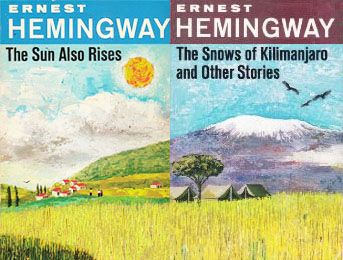
Cover illustrations by James and Ruth McCrea

Summer is a time when I do most of my fiction reading now. Below is an unpublished blog I did on Ernest Hemingway a couple of years ago. I don't know why I didn't post it, except that I was hoping to do more of a literary critique of his books, and especially of The Sun Also Rises, which I recently started to re-read, marking the pages that affected me. The Sun Also Rises was one of my favorite books when I was in university - in graduate school to be exact - when I was was studying endless scientific research papers to fine tune my thesis. I would read just a few pages of the lovely script before embarking on journal articles. If I read too much, that would be the end of my "serious" studies, and I would spend the rest of the time on the book.

Here's what I wrote in my unpublished blog:
Summer Reading

Hemingway was a favorite of mine, back when I used to carry fiction books with me wherever I went. I don't do that as much now, but I do keep up with my fiction reading. I’m often re-reading older classics. Jane Austen's Emma and Tolstoy's Anna Karenina are perennial favorites. Contemporary fiction writers leave me unsatisfied. I can see their talent (of the talented ones, that is), but their stories are imbued with their personalities, as though they cannot shake off their egos as they write. Their stories also have macabre, strange, or nihilistic endings, and I come away bewildered or depressed.

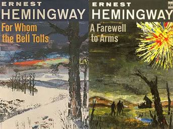
Cover illustrations by James and Ruth McCrea

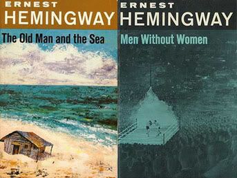
I've read four of Hemingway’s books: The Sun Also Rises, A Farewell to Arms, The Old Man and the Sea and For Whom the Bell Tolls. And his collection of short stories: The Snows of Kilimanjaro and Other Stories and Men Without Women. I'm not a literary critic, so I don't really know how to start analyzing Hemingway's writing - it's already been done ad infinitum anyway by experts and laymen alike. But, his stories are accounts of unrequited love in many ways. The characters, which he brings to life so clearly, are very modern people who enter all kinds of debacles, yet they come out surprisingly pure and unblemished despite their weaknesses and failures.

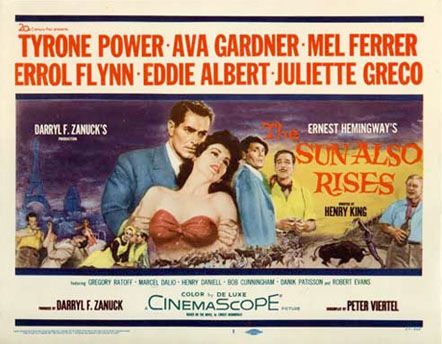
Tyrone Power, Ava Gardner and Eroll Flynn
in a 1957 film adaptation of The Sun Also Rises
Directed by Henry King

King also directed Ava Gardner in 1952 in
The Snows of Kilimanjaro, another Hemingway adaptation
Cover illustrations by James and Ruth McCrea

What surprised me reading Hemingway this time around are the long, unending sentences that Hemingway uses at times, producing an almost trance-like meditative quality. This goes against the hard simplicity of his prose that many analysts have described about his writing. His description of places, whether it is a café in Paris or the Spanish (and Italian) countryside resonates in my mind – always has – and urges me to visit these vivid locales.

[End of original (unpublished) blog entry.]
Here's an excerpt from The Sun Also Rises as Jake Barnes, who is the narrator and protagonist, describes their entry into Spain:
Then we crossed a wide plain, and there was a big river off on the right shining in the sun from between the line of trees, and away off you could see the plateau of Pamplona rising out of the plain, and the walls of the city, and the great brown cathedral, and the broken skyline of the other churches. In the back of the plateau were the mountains, and every way you looked there were other mountains, and ahead the road stretched out white across the plain going toward Pamplona.

[Hemingway, Ernest. The Sun also Rises. New York: Charles Scribner's Sons, 1954. pp. 93-93]
But looking at the stamp in my (worn) The Sun Also Rises, I find this:
Paper Back Junction
343 East Main Street
Lock Haven, PA 17745
So I was a fan of Hemingway even as an undergraduate in the small Pennsylvania college where I was a busy biology student!

The first pages of the book has these two quotes:
"You are all a lost generation"
- Gertrude Stein in conversation

- "One generation passeth away, and another generation cometh; but the earth abideth for ever...The sun also ariseth, and the sun goeth down, and hasteth to his place where he arose...The wind goeth toward the south, and turneth about unto the north; it whirleth about continually, and the wind returneth again according to his circuits...All the rivers run into the sea; yet the sea is not full; unto the place from whence the rivers come, thither they return again."
- Ecclesiastes
The nihilist, modernist, Stein is juxtaposed with a biblical account of the fullness, continuation and eternity of God's creations and of life. This odd, disconcerting juxtaposition is partly what makes The Sun Also Rises a masterpiece: people never quite give up on life, and on love, despite the devastations many have been through.

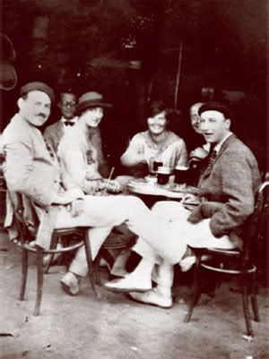
Below is a photo of Hemingway in Pamplona in 1925, which I blogged about here. Hemingway first edition of The Sun Also Rises was published in 1926.
Left to right Ernest Hemingway with Lady Duff Twysden,
Hadley Hemingway, and three unidentified
people at a cafe in Pamplona, Spain, July 1925.

[Photograph in the Ernest Hemingway Photograph
Collection, John F. Kennedy Presidential Library
and Museum, Boston.]

Read More...

Monday, May 07, 2012

How to Wear a $990 T-Shirt


A spiteful blogger at the Washington Post writes:
Ann Romney has been coming under fire for wearing a $990 Reed Krakoff t-shirt on the air recently. Never mind that Reed Krakoff sounds like a rejected Hunger Games character. This is a Serious National Issue.

My biggest objection to the shirt is that it looked like a disembodied fish-bird was squinting at you off Ann Romney’s right shoulder.

That is a nightmarish vision with which I would as soon not contend. That someone would pay this amount of money so that a disgruntled yellow creature could give TV audiences the stink-eye is the sort of thing that makes even the staunchest Reaganian rethink his stance on trickle-down economics.
Of course, this comment is directed at the "99%" who cannot afford $990 silk shirts. In the usual fascistic and dogmatic manner of liberals, everyone has to wear the $9 t-shirt that caters to the lowest common denominator. And all those who can afford to buy $990 t-shirts have to hand out their money to those who somehow got behind in buying designer shirts, and wear the $9 t-shirt uniform in solidarity. Never mind those 1% (i.e. the Romneys) who bought their shirts with their hard-earned money.

Never mind that the t-shirt (or silk shirt, as what it really is) has a print of John James Aududon's Gyrfalcon, which is an illustration of a large falcon native to North America.

Audubon's book of illustrations, Birds of America, was an ambitious project of,
435 hand-colored, life-size prints of 497 [North American] bird species, made from engraved copper plates...[which] contains just over 700 North American bird species.
The books also features the gyrfalcon.

So how "un-American" can Ann Romney be, with her instinctive ability to wear a shirt featuring an American illustrator's American bird, while accompanying her husband on a campaign interview at CBS This Morning a few days ago? Michelle Obama also likes to wear large prints, yet I have never found any of hers to have cultrual significance other than to promote "designers of color."

That said, Reed Krakoff, the designer who created Ann Romney's shirt, took the liberty of adding extra colors to the print on Ann Romeny's shirt, since Audubon's bird is mostly white, black and with touches of color, as are the colors of the actual bird. Krakoff's website says:
The bird painting was inspired by John James Audubon' s iconic painting of gyrfalcons, recolored and manipulated to a larger-than-life scale for a bold and modern effect.
Detail of Reed Krakoff's gyrfalcon

Still, good design is a reinterpretation of what is out there to fit the item on which it is displayed (a piece of clothing, a furniture), and I'm sure Audubon would have found it an honor to be part of American political history.

Gyrfalcon
By John James Audubon (1785-1851)
From: The Birds of America; from original
drawings by John James Audubon

Publication date 1827 - 1838

About the gyrfalcon:
The Gyrfalcon is dispersed throughout much of the Northern Hemisphere, with populations in Northern America, Greenland, and Northern Europe. Its plumage varies with location, with birds being coloured from all-white to dark brown.

The bird's common name comes from French gerfaucon; in medieval Latin it is gyrofalco. The first part of the word may come from Old High German gîr (cf. modern German Geier) for "vulture", referring to its size compared to other falcons; or from the Latin gȳrus for "circle" or "curved path"—from the species' circling as it searches for prey, distinct from the hunting of other falcons in its range. The male Gyrfalcon is called a gyrkin in falconry. The scientific name is composed of the Latin term for a falcon, Falco, and for a countryside-dweller, rusticolus. (More here)

Read More...

Friday, April 06, 2012

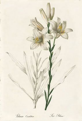
Madonna Lily

Madonna Lily (circa 1802)
Pierre-Joseph Redouté


I cannot find any Easter lilies by botanical artist Pierre-Joseph Redouté, but I have found instead his Madonna Lily.

Read More...

Thursday, April 05, 2012

Hydrangea

Hortensia (Hydrangea)
by Pierre-Joseph Redoute, (circa 1827)


Read More...

Tuesday, July 26, 2011

What's the song?

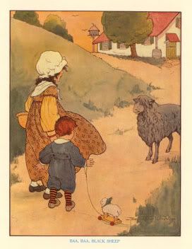
"Baa Baa Black Sheep"
Illustration by children's
books illustrator
Blanche Fisher Wright


What's this song?

"Ba ba ba ba, bababababa!"

Of course, it's "Baa baa black sheep, have you any wool?"

Courtesy of my little toddler neighbor across the street, singing the first line full throttle, and perfectly in tune.

He only "knows" the first line - so far.

Baa baa black sheep (Youtbe link, in case you don't know it. :).

Baa, baa, black sheep,
Have you any wool?
Yes sir, yes sir,
Three bags full.

One for my master,
One for my dame,
And one for the little boy
Who lives down the lane.

Baa, baa, black sheep,
Have you any wool?
Yes sir, yes sir,
Three bags full.

As always with "critics" of contemporary culture, there is an insidious attempt to destroy (or "reform") traditional culture. Here is what Wikipedia says about the song :
Modern controversies

A controversy emerged over changing the language of 'Baa Baa Black Sheep' in Britain from 1986, because, it was alleged in the popular press, it was seen as racially dubious. This was, as Curran, Pently and Gaber indicate, based only on a rewriting of the rhyme in one private nursery as an exercise for the children there and not on any local government policy. A similar controversy emerged in 1999 when reservations about the rhyme were submitted to Birmingham City Council by a working group on racism in children's resources, which were never approved or implemented.[5] Two private nurseries in Oxfordshire in 2006 altered the song to "Baa Baa Rainbow Sheep", with black being replaced with a variety of other adjectives, like "happy, sad, hopping" and "pink". Commentators have asserted that these controversies have been exaggerated or distorted by some elements of the press as part of a more general campaign against political correctness.
You can read more of this at Wikipedia. Proceed with caution.

About Blanche Fisher Wright:
At this point, I read to my daughter from The Real Mother Goose mostly as an excuse to pour over the illustrations by Blanche Fisher Wright. Elegant and utterly charming, they sit shoulder to shoulder with the work of the great turn-of-the-century illustrators like Edward Penfield and Jesse Wilcox Smith (Philly’s own, Smith, born in Mt. Airy, studied at PAFA under Thomas Eakins and Howard Pyle at the Brandywine School) But what really captivates me about her work is the degree to which, stylistically, they recall the work of Art Nouveau masters like Alphons Mucha. They share the regal faces, flowing outlines, graphic crispness and posterlike composition. What transforms them into bewitching illustrations is her wonderful animating sense of gesture and flair for scene staging. Given her skill and achievement, her complete anonymity is surprising. Other than a few basic illustration credits, no biographical information exists online. She is absent from Walt Reed’s comprehensive Illustrator in America survey. Although The Real Mother Goose remains in print and easily available, Blanche Fisher Wright, at least for now, seems a near to complete mystery.
I'm just glad that this little boy sings the nursery rhyme with such gusto.

Read More...

Thursday, July 21, 2011

The Art and Science of Lilies

Madonna Lily
Pierre-Joseph Redouté

I've searched around for the names of the lilies on my previous post and Pink Damask looks like a better fit for the first lily than Tiger Lily. And the second could be a Sammy Russell.

Here is a pretty comprehensive on-line source on lilies.

Lilies have been a special subject of two botanical illustrators of the 19th century. I think the attention given them is because they are so varied and numerous, as well as having many symbolic references in religion and literature.

I have already referenced W.H. Fitch in a previous blog post. Fitch illustrated A Monograph of the Genus Lilium (1877-1880) by the British scientist H.J. Elwes.

The second is by the renowned illustrator Pierre-Joseph Redouté, who has a whole treatise on lilies in his Les Liliacées.

Read More...

Friday, July 15, 2011

"I'll See You In My Dreams"

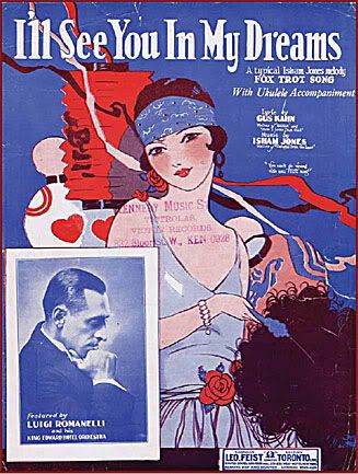
Sheet Music for "I'll See You in My Dreams"

- Inset photo is of Luigi Romanelli, who led the orchestra at the King Edward.

- A larger version of the illustration is in the pdf article "An Illustrated History of
the King Edward Hotel," page 41.

- The song "I'll See You in My Dreams" on the sheet music above is described as "A typical Isham Jones melody fox trot song" with lyrics by Gus Kahn and music by Isham Jones.

I'll See You in My Dreams (Youtube Link)

I'll see you in my dreams,
Hold you in my dreams,
Someone took you out of my arms,
Still I feel the thrill of your charms!

Lips that once were mine,
Tender eyes that shine,
They will light my way tonight,
I'll see you in my dreams!

Though the days are long,
Twilight sings a song,
Of the happiness that used to be;
Soon my eyes will close,
Soon I'll find repose,
And in dreams you're always near to me.

A commentator on the above Youtube source says that the piece was performed by Ray Miller and his Brunswick Orchestra and released by his Brunswick label. It was recorded on 12-4-1924 in NYC. I cannot find information the vocalist.
--------------------------------------------------------------------------------------------------

In its heyday, the King Edward patrons were privy to the latest entertainment by the Hotel's orchestra. Above is a 1920s poster that is advertising an upcoming performance by Luigi Romanelli and His King Edward Hotel Orchestra. Romanelli performed at the King Edward from 1923 to the 1940s. What hotel has its own orchestra, let alone hosts dance evenings on a regular basis? Not the current King Edward.

Here's some background on Romanelli, including his Toronto vocalist Gladys Smith, who later on became famous as Mary Pickford:
Luigi Romanelli, a violinist, performed on the streets of Toronto. He and dancer, George Weitz, worked Yonge at Bloor. Weitz achieved fame as producer of a series of Broadway reviews, "George White's Scandals." Romanelli made his vaudeville debut, in 1897, with Gladys Smith, from Toronto. She's better known as Mary Pickford.

Romanelli lead the first orchestra heard on radio. The live broadcast came via CKCA-AM and from Shea's Theatre, in Toronto. That was 1922. Not long after, the Romanelli Orchestra had its own live radio shows on the NBC Blue Network.
Here's more autobiographical information on Romanelli as a musician:
Romanelli, Luigi. Orchestra leader, violinist, b[orn] Belleville, Ont, 29 Nov 1885, d[ied] Murray Bay (La Malbaie), Que, 29 Jul 1942. He was the son of the Italian-born harpist Joseph Romanelli (1859-1944, a concert and theatre musician in Toronto) and a nephew of Rocco Romanelli (d 1941, a violinist known as 'Romanelli the Great,' who toured briefly with Enrico Caruso in the USA and accompanied Nellie Melba).

In his youth Luigi Romanelli played the violin on Toronto street corners for a young dancer, George Weitz (later of George White Scandals fame), and at 12 made his stage debut as an actor with Mary Pickford (then known as Gladys Smith)...His was one of the first theatre orchestras to accompany silent films with descriptive music. The Romanelli orchestra at Shea's Theatre is thought to have been the first in Canada to broadcast on radio (1922, over CFCA).

In his day one of Canada's most popular orchestra leaders, Romanelli became music director for United Hotels in Canada in 1923 and at his death had performed at the King Edward Hotel, Toronto, for more than 20 years...Romanelli's 11-piece radio orchestra, the Monarchs of Melody, was heard on CRBC and CBC and, occasionally, in the USA on NBC's 'Blue' network.
King Edward also had its own radio broadcasting station from 1928 on (from pdf article p. 43):
On March 5, 1928, radio station CKGW beamed out its first broadcast from an ultramodern studio in the King Edward Hotel. “Tonight marks one great step forward in the history of radio broadcasting in the Dominion of Canada,” broadcast manager N. E. Maysmith announced with pardonable pride...

It also made sense, because it promoted the hotel itself. Broadcasting from six to midnight, CKGW offered mining news, weather, but mostly music. Romanelli and the hotel were front and centre on the schedule. Dinner music from the King Edward Hotel ... Luigi Romanelli and his Radio Syncopaters ... Supper Music by LuigiRomanelli and his King Edward Hotel Orchestra from the Oak Room of the hotel …And so it went for about five to six years, before the station moved out of the hotel and was ultimately rolled into something called the CBC.
The grandness of the hotel is still palpable. It almost seem to be still inhabited by the gentle ghosts of these bygone personalities (including the hotel patrons who came to enjoy a few days of relaxation - even busy business men entered an oasis when they came here).

The great news is that the hotel is undergoing renovations, mainly to restore it to its original state. Many of the downtown heritage buildings are getting similar attention, which seems to be a new focus to revive the important architectural sites in the city, and to curtail the encroaching glass-dominated high rise buildings which are often erected after the former have been demolished.

Here is the heritage plaque on the hotel.
The King Edward Hotel was built by George Gooderham's Toronto Hotel Company to meet the demand in the rising metropolis for a grand hotel. When in opened in 1903, the hotel, affectionately known as the "King Eddy", was embraced by the city. The fireproof, eight-storey building, designed by eminent Chicago architect Henry Ives Cobb and prominent Toronto architect E.J. Lennox, provided luxury in service in dramatic settings. The 18-storey tower, with its top-floor Crystal Ballroom, was added in 1920-21 to enlarge the hotel. Although threatened with demolition in the 1970s, the hotel was revitalized in 1980-81. On its 100th anniversary in 2003, the King Edward, Toronto's first luxury hotel, remains a vibrant and elegant meeting place for local and international visitors.

Read More...

Monday, October 18, 2010

Fashion and Art: A Continuing Exploration

The Legacy of Aubrey Beardsley

Since one of my ongoing themes at Camera Lucida these days is fashion and art, I have reproduced below a much earlier blog entry on Vogue illustrations. Aubrey Beardsley, a well-known illustrator in his time, produced drawings and illustrations that reminded me of the early Vogue covers from the 1920s. I am not sure if he directly influenced those Vogue illustrators, but when I compare them with his drawings, I am compelled to conclude that he did indeed influence those styles.

This  once again shows (me at least) that the early 20th century was infused with art and creativity (see the links to my previous posts on this subject at the end of this one),  and painters, illustrators, designers and all kinds of creative professionals constantly borrowed from one another.

We might be heading in that direction in the early 21 century, but I wouldn't hold my breath just yet. Still, one example I ran across is a photographic rendition of actress Nicole Kidman as the American painter John Singer Sargent's Madam X in the October 2010 issue of Vogue. Sargent  lived into his seventies until 1925, and thus saw something of the avant-garde.

Kidman's photograph is by fashion photographer Steven Meisel and was originally in the June 1999 issue of Vogue . There is nothing derisive about being called a "fashion photographer" these days. In fact it is something of an honor. There are more interesting fashion photographs now than many other styles of photography.

The early post "The Legacy of Aubrey Beardsley" is reproduced below.

---------------------------------------------------------------------------

The Legacy of Aubrey Beardsley


Aubrey Beardsley lived a short life of twenty five years. His drawings, many used to illustrate books and posters, had a sense of foreboding about them, often with androgynous figures with cruel expressions. Kenneth Clark, the art critic and writer says that Beardsley knew about Evil.

(Left, Aubrey Beardsley, The Black Cape)
(Right, Condé Nast Vogue Cover, 1920s)


His many illustrated books included: Oscar Wilde’s play “Salomé”, an art an literary magazine called “The Yellow Book” of which he was the art editor, and Alexander Pope’s “The Rape of the Lock”.

( Left: Aubrey Beardsley's Cover design for Smithers catalogue of rare books)


(Left: Condé Naste Vogue Cover, 1920s) 
(Right Aubrey Beardsley, Isolde)


Close to his death (due to tuberculosis) he converted to Catholicism and died at the very end of the nineteenth century.


These Condé Nast Publications for Vogue Magazine reminded me of Beardsley’s illustrations. Most of the Vogue illustrations are from the turn of the twentieth century (1912-15). Beardsley’s beautiful (but disturbing) images have found their true place. Decorating the women he tried so much to put in a favorable light.

(Left: Aubrey Beardsley: La Dame aux Camelias)
(Right: Condé Nast Vogue Cover, 1920s)


(Aubrey Beardsley: The Peacock Skirt)


Previous posts on art and fashion in the early 20th century:

Small Gems at the Art Gallery of Ontario
Fashion and Art: Music's Influence
Lalique and Chanel
Gabriel Yared's Soundtrack for Coco and Igor
Reliving the 1920s through Perfume
Chanel's Concoctions: Perfume and Culture


Read More...

Saturday, February 20, 2010

Drawing Vs. Photography

The winner is clear

Preliminary watercolor sketch

There's nothing more uncanny then when a blank piece of watercolor paper gets filled up with lines and colors representing some "real" object or other.

I used to feel this way with photography. The slow, magical way in which the image appears on the photographic paper is always surprising. But drawing is that much more satisfying because it is infinitely harder, since the exercise involves much more (intellectually and technically) than the photographic process. I'll stick to that opinion, and photographers the world over will pounce on me, I know.

Of course, this conflict between photography and drawing/painting has been an eternal one. But, despite all the clever and sophisticated arguments that photographers make, however "differently" they present themselves, however beautifully they represent the world around us, drawing and painting wins hands down.

Read More...

Thursday, February 05, 2009

More Obama Fiasco

Hope as plagiarism

AP claims to own the photo from which the
graphic poster was designed, and wants
compensation.


Shepard Fairey, Obama's designer for the famous "HOPE" poster is facing copyright issues. Story here.

Fairey is also being scrutinized for plagiarism of various other graphic works that he has done. The graphic artist who is following this case says:
What initially disturbed me about the art of Shepard Fairey is that it displays none of the line, modeling and other idiosyncrasies that reveal an artist’s unique personal style. His imagery appears as though it’s xeroxed or run through some computer graphics program; that is to say, it is machine art that any second-rate art student could produce.
Contemporary design - whether graphic, textile or even web - is highly dependent on "copying" or using already existing images. I think this speaks of the dearth of drawing and illustration skills that would have been essential in the non-photography, non-xerox age.

This actually curtails the imagination of the designer, and even the precision (and aesthetic quality) of the work. Details that can be changed with a pencil and an eraser are ignored because they would take up too much time on the computer or the xerox machine.

I intuitively feel that this also determines the type of person who would design such a graphic work, one who might be more of a (hurried) ideologue than a careful artist. This is an idea I will work on.

Read More...

Sunday, June 08, 2008

Exotic Plants

And immigration

From Michaux's "North American Sylva."
White Oak by P. Bessa, 1857


Botanical illustration took a tremendous stride during the centuries of discovery when European travelers were mesmerized by exotic plants they found in foreign lands. Since bringing the plants was not always an option, many talented illustrators brought back pictures instead. It was during this time that the articulate, precise and often beautiful illustrations gained prestige. Adventure combined with beauty must have been a worthwhile endeavor.

Exotica has always been admired from afar, either through paintings and other records, or through travel to its source. But, as travelers found ways to bring back these plants across continents to their own homelands, they had to be careful that their native plants would not be over-run by these foreign specimens.

Tree expert Todd Irvine, from Local Enhancement and Appreciation of Forests (LEAF), was explaining the dangers of exotic plants to native plant growth during his lecture on trees at a recent Botanical Artists of Canada annual meeting.

The Norway spruce, brought here from northern Europe, is one example of a tree which is easy to cultivate and which grows at an incredibly fast rate, displacing other plants and trees in record time. Garden stores sell it without any qualms whatsoever, despite knowing the dangers, and, I believe, guided by money. It is taking over the more lethargic and slow-growing oaks, maples and beeches and is on the invasive plants watch list for Canada.

There is a morality tale here.

Just as some plants can completely change the make-up of the surrounding vegetations, so can some groups of people change, possibly irreparably, the fabric of society.

Toronto, sanctioned by its leaders, is doing the same thing. The exotica has now a full-blown entry into ordinary society, unprecedented in previous centuries, where even one wayward entrance would cause consternation and worry.

Hindu temples and mosques are trudging in at spectacular speed and replacing Protestant and Catholic churches. And whole suburban regions are replacing the original settlers with Chinese and Indian populations.

So, in this atmosphere, who will keep up the prized tradition of botanical art, which ironically flourished because those exotica were kept in their own lands? Like LEAF's gargantuan project, botanical art in Canada is becoming local, with many exhibitions stressing "native plants." I wonder if our Toronto representatives will do the same for our population, while finding ways to get rid of the encroaching usurpers?


Read More...

Sunday, February 03, 2008

Flat, Simple and Funny

Charley Harper's Illustrations

It is always a pleasure to find an innovative artist who eschews the avant-garde mentality. Charley Harper (1922-2007) made his first claim to fame when he illustrated The Golden Book of Biology, and The Animal Kingdom. Although not pure realism, his illustrations are nonetheless realistic. He calls his work "minimal realism" and he describes it as "flat, simple and funny."

I think they are more than that, with a certain charm, rhythm, and a story to them.

Birch, Bark and Birds

Double Lucky

Octoberama

Trumpeter Swan

Migration Mainline, Cape May


Read More...

Monday, December 12, 2005

Vogue Cover Illustrations

The Legacy of Aubrey Beardsley


Aubrey Beardsley lived a short life of twenty five years. His drawings, many used to illustrate books and posters, had a sense of foreboding about them, often with androgynous figures with cruel expressions. Kenneth Clark, the art critic and writer says that Beardsley knew about Evil.

(Left, Aubrey Beardsley, The Black Cape)
(Right, Condé Nast Vogue Cover, 1920s)


His many illustrated books included: Oscar Wilde’s play “Salomé”, an art an literary magazine called “The Yellow Book” of which he was the art editor, and Alexander Pope’s “The Rape of the Lock”.

( Left: Aubrey Beardsley's Cover design for Smithers catalogue of rare books)


(Left: Condé Naste Vogue Cover, 1920s) 
(Right Aubrey Beardsley, Isolde)


Close to his death (due to tuberculosis) he converted to Catholicism and died at the very end of the nineteenth century.


These Condé Nast Publications for Vogue Magazine reminded me of Beardsley’s illustrations. Most of the Vogue illustrations are from the turn of the twentieth century (1912-15). Beardsley’s beautiful (but disturbing) images have found their true place. Decorating the women he tried so much to put in a favorable light.

(Left: Aubrey Beardsley: La Dame aux Camelias)
(Right: Condé Nast Vogue Cover, 1920s)


(Aubrey Beardsley: The Peacock Skirt)


Read More...