Showing posts with label Museums. Show all posts

Sunday, September 09, 2012

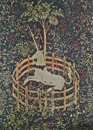
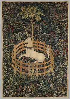
Flowers of the Unicorn Tapestry

The Unicorn in Captivity
South Netherlandish, 1495-1505
Wool warp with wool, silk, sliver, and gilt wefts
12ft. 7/18 in. x 8 ft. 3 in.
The Cloisters, Metropolitan Museum of Art
Gift of John D. Rockefeller Jr., 1937


I had been wanting to see the Unicorn Tapestries at the Cloisters for many years. I have blogged about them here, and even written about their floral designs in this article (posted on my blog) on plants in the decorative arts (the original pdf article is on pp 3-4 of the Summer 2007 issue of the Botanical Artists of Canada Newsletter). As I wrote in my blog post in 2010 (when I first wanted to see them):
I have never been to The Cloisters, but have always known that they house the beautiful tapestries The Hunt of the Unicorn. But, I was lucky to see another set of unicorn tapestries, The Lady and the Unicorn (La Dame à la Licorne), housed in the Musée de Cluny, in Paris.
And from my article:
One of the most enchanting mergers of scientific observation and religious symbolism are the tapestries of the Hunt of the Unicorn. These tapestries are covered with the late Medieval tradition of fields of millefleurs. When analyzed carefully, many of these flowers are clearly identifiable, in their correct environment. The Madonna Lily, depicted in The Unicorn in Captivity tapestry, is both a religious symbol of the purity of Mary and also a medicinal plant that treated burns, ulcers and ear infections, amongst other things.
Finally, I got to see them during my trip in New York this past August. I tried to take photos (without my flash, as instructed by the guards), but couldn't come up with any decent images, so I had to make do with a postcard of The Unicorn in Captivity from the gift shop.

Here is a link to the Met, which has details of the flowers on the tapestry:
The Unicorn Tapestries: Flowers, Plants and Trees

Read More...

Saturday, August 25, 2012

At the Cloisters

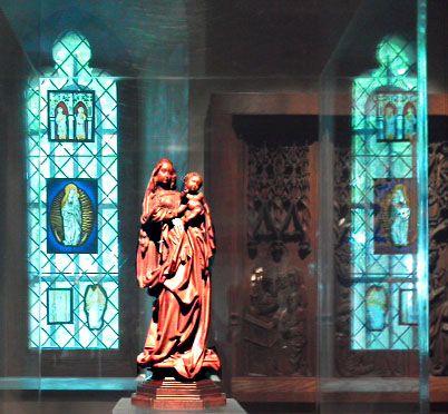
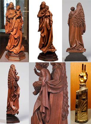
Standing Virgin and Child
Attributed to Nikolaus Gerhaert von Leiden
(North Netherlandish, active in Strasbourg, 1460–1473)
Date: ca. 1470
Medium: Boxwood, tinted lips and eyes
Dimensions: 13 1/4 x 5 1/8 x 3 9/16 in.


Above is a photo I took of The Standing Virgin at the Cloisters Medieval Gallery in New York. She is enclosed in glass. I wasn't aware that I couldn't use my flash. The museum staff were quick to point that out to me, upon seeing the sudden flash of light. I apologized - I really don't want to participate in the destruction of these beautiful pieces. The damage was done, but I got the lovely photo above, with the light glowing on the faces of Mary and Jesus, and on the folds of Mary's robe. The stained glass window on the left, part of the collection in the Treasury, is reflected in the glass on the right.

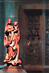
Although it isn't that unusual to see a depiction of the Madonna and child in stained glass windows, it is still a little bit of a coincidence that the image in the glass behind The Standing Virgin also depicts the Madonna and Child. I instinctively included the whole of the stained glass background, although most photos I find of this sculpture crop off the background (as I show in the collage below - one even obstructs a stained glass with the sculpture). For example, this could have been a perfectly acceptable version, which focuses almost entirely on the sculpture (I cropped the image in photoshop, not in camera):

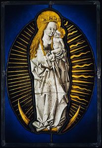
The stained glass is:


Virgin of the Apocalypse
Circle of the Master of the Amsterdam Cabinet (active 1470-90)

Date: ca. 1480–90
Geography: Made in, Middle Rhine, Germany
Culture: German
Medium: Colorless glass, silver stain, and vitreous paint
Dimensions: 13 7/8 x 9 5/8in.

The imagery depicted on this panel derives from the Book of Revelation, which describes "a woman clothed with the sun, with the moon under her feet, and on her head a crown of twelve stars" (12:1). The Virgin standing on a crescent moon, surrounded by rays of light, is a specific iconographic type, of German origin, which became popular by the middle of the fifteenth century. Encircled by the rays of perfect light, the Virgin, Queen of Heaven, outshines the transitory and evanescent nature of all other realms, just as the sun dissipates the light of the moon.

The softness and delicacy of the figures, as well as the unmannered, free use of line, place this panel in the immediate circle of the Master of the Amsterdam Cabinet, arguably the greatest graphic artist active in northern Europe before Albrecht Dürer. [Source: Metropolitan Museum]
------------------------------------------------------------------------------------------------------

I've written about the external beauty of the Cloisters here and here, but the Cloisters also house an expansive, and beautiful, collection of medieval art. The Standing Virgin is in the newly re-opened Treasury, which is:
an intimate gallery displaying some of the most precious small-scale works at The Cloisters, the branch of The Metropolitan Museum of Art dedicated to the art and architecture of the Middle Ages – has reopened to the public after two years of renovation. Originally constructed in 1988 in celebration of the 50th anniversary of the opening of The Cloisters, the Treasury houses small luxury objects acquired in the years subsequent to the branch museum's 1938 founding. [More on the Treasury here]
It was The Standing Virgin that caught my attention. I was taken in by the intricate carvings of her robe, her expression which is a mixture of alarm (she sees something in front of her) and expectancy, and her playful infant with his chubby cheeks and legs. Yet, this is clearly Jesus, who is blessing us. The guide who took us around said that the sideways view is as important (if not more important) than the view from the front, since Mary is holding her child sightly forward, so that his two-finger blessing is clearly visible from the side, and he is slightly ahead of Mary, making him more important then her. I found the back view also important, but in an artistic sense. The carver has not cut any corners with the back, giving us a detailed carving of her long locks, Jesus' curly hair, and the shawl on Mary's head which is draped forward leading us to Jesus' hand which is holding it at the front.

The Standing Virgin, images acquired from
various sources around the web.


In the bottom right of the collage is a reliquary arm.

Here's what the Metropolitan Museum's website says about this object:
Reliquary Arm, ca. 1230
South Netherlandish
Silver over oak; hand: bronze-gilt; appliqué plaques: silver-gilt, niello and cabochon stones
25 1/2 x 6 1/2 x 4 in.
The Cloisters Collection, 1947 (47.101.33)


Precious containers for relics—the bones of a holy person, or objects touched by that person—are among the most inventive and accomplished works of art in the Middle Ages. In this reliquary, a silver and gilded arm is bordered both by decorative filigree plaques set with gems and antique cameos, and figurative scenes crafted in niello on silver. These plaques include images of saints Peter and Paul, perhaps the patrons of the church from which this reliquary originally came. As a reliquary was thought to retain the power and holiness of the saintly person, clergy used arm reliquaries to bless people or heal the sick.
It is of course a larger, and more imposing (and truncated!) version of the blessing that Jesus is giving in the sculpture.

The wood used to sculpt The Standing Virgin is a rich, red wood. It is identified as "Boxwood" in the catalogs. Wikipedia says this about Boxwood:
Owing to its fine grain it is a good wood for fine wood carving, although this is limited by the small sizes available. It is also resistant to splitting and chipping, and thus useful for decorative or storage boxes. Formerly, it was used for wooden combs.

Owing to the relatively high density of the wood (it is one of the few woods that are denser than water), boxwood is often used for chess pieces, unstained boxwood for the white pieces and stained ('ebonized') boxwood for the black pieces, in lieu of ebony.

The extremely fine endgrain of box makes it suitable for woodblock printing.
And this about its use for musical instruments:
Due to its high density and resistance to chipping, boxwood is a relatively economical material used to make parts for various stringed instruments. It is mostly used to make tailpieces, chin rests and tuning pegs, but may be used for a variety of other parts as well. Other woods used for this purpose are rosewood and ebony.

Boxwood was a common material for the manufacture of recorders in the eighteenth century, and a large number of mid- to high-end instruments made today are produced from one or other species of boxwood. Boxwood was once a popular wood for other woodwind instruments, and was among the traditional woods for Great Highland bagpipes before tastes turned to imported dense tropical woods such as cocuswood, ebony, and African blackwood.
The Standing Virgin is attributed to Nicolaus Gerhaert von Leiden. She stands about 13 1/4 inches high, and was carved around 1470 [Source: MetMuseum.org].

Here is biographical information on the sculptor Nicolaus Gerhaert von Leiden:
Gerhaert is considered the most influential northern European sculptor of the 15th century. He was born in Leiden, Holland (present day Netherlands) sometime around 1420. Based on the location of his work, we know he spent most his working life in the Germanic areas of Trier, Straßburg, Baden, Konstanz, and Vienna. Much of his documented work is lost to history, but what has survived is characterized by elaborate drapery and extreme physical realism, both extraordinarily vivid and unconventional. His specialties were tombs, altarpieces and other religious pieces. Sandstone and limestone are among his most frequent mediums.

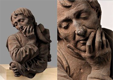
One of his most well known works currently resides in the Musée de l’Œuvre Notre-Dame in Strasbourg (Alsace, present day France). Called the Buste d'homme accoudé (1467), it is an indisputed masterpiece, and is believed to be a self-portrait. Gerhaert died on 28 June 1473 in Wiener Neustadt (present day Austria)
Man Meditating (Buste d'homme accoudé),
an apparent self-portrait, c. 1467


Another source describes the stone as Red Sandstone. Gerhaert seems to like rich rose colored media, like the boxwood he used for The Standing Virgin and the reddish sandstone he used Man Meditating. The Cloisters also incorporate pink marble from the Saint-Michel-de-Cuxa Benedictine monastery, located at the foot of Mount Canigou in the northeast Pyrenees of France, into the architecture. More current areas of the building also retain that warm, pinkish hue.

Read More...

Wednesday, August 22, 2012

A View Across the Hudson


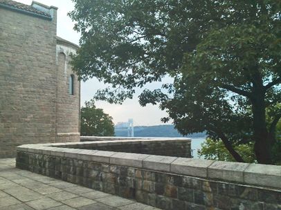
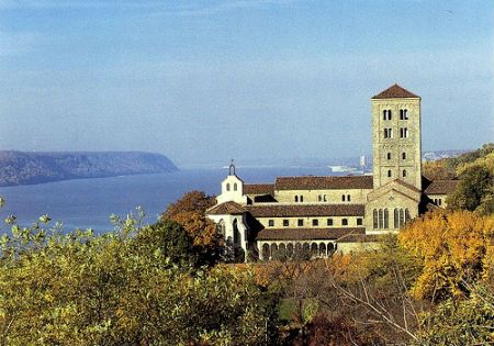
This is a photo I took from Cloisters' terrace with a view of the George Washington Bridge and the Hudson River. Across the river is New Jersey, and the undeveloped stretch of land is the New Jersey Palisades. John D. Rockefeller had the Cloisters built especially to house his medieval collection. He also bought several acres of the Palisade hills across the river in order to have the best view possible from the Cloisters.

Below is a Wikipedia image of the Palisades with the Hudson River and the George Washington Bridge (more on the Palisades at the link provided):


Read More...

Sunday, August 12, 2012

A Road Less Taken

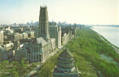
A view of the Cloisters with the Hudson River

I cannot upload photos from my camera to the computer I'm using while in New York. I will make a file (a post) of photos I took here when I return to Toronto.

But, there are plenty of online images to download.

I tried to get to the Cloisters today. They are a branch of the Metropolitan Museum, but they are somewhere in the Netherlands of New York City. They are located in an area called Fort Tyron Park. The closest street intersection is 190th Street. I'm not sure if this is the Bronx, or if it is still Harlem, but I decided to take the M4 bus which supposedly goes straight there. It didn't happen so easily.

There was some kind of parade (actually it was the Puerto Rican Day Parade, or more precisely the National Puerto Rican Day Parade - what is "national" about Puerto Ricans in New York?) which held up buses between 44th and 79th on Fifth Avenue. At one point I waited close to half an hour to get a bus. When one finally arrived and we climbed on, we had to get off on 135th Street because...well the driver couldn't give a reason. He parked the bus and waited inside. Then this parked bus suddenly took life, and the patient group that was waiting for another (some people just left - to catch a cab?!) was allowed back on this one.

But it really was worth the wait. The ride on the M4 from about 135th street down to 79th was incredible. The bus went down Riverside Drive, along the Hudson and past the beautiful Riverside Church (which I think is even more beautiful than St. Patrick's, or St. John the Divine's just above 110th Street) until the driver turned on 79th Street and took Broadway. I went all the way to 59th Street and Columbus Circle and took the M10 down Central Park West, to get more views of another of New York's beautiful park. I got off just before 110th Street, where Central Park ends, to get to where I was staying on the Upper West Side. The ride took shorter than I thought, although it is a good 45 minutes. I highly recommend this "tour" for a mere bus token ($2.25). There were plenty of tourist buses taking a similar route, and I'm sure their's was an expensive affair.

A view of the Riverside Church with the Hudson River

One of the reasons I wanted (want) to go to the Cloisters is to see the beautiful unicorn tapestries.

The Unicorn in Captivity
At The Cloisters


(I've linked to backgrounds on The Cloisters and the tapestries, but I will write some more tomorrow on how they got to New York and to such a location. It is a fascinating bit of New York history.)

Read More...

Adept Attackers of Beauty

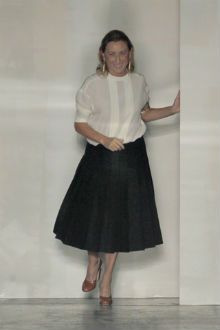
Frumpy, home-body Miu Miu

I sent the email below, along with a link of my blog post From Schiaparelli to Prada: Deterioration of Culture to a correspondent.

I have written a long post on the Met's exhibition "Schiaparelli & Prada, Impossible Conversations" (linked above), but this email adds more on my ideas and observations about the decline, or perversion, of culture that I see around me. Art, and artists, are often the first to grasp (either by accepting or rejecting) societal changes. I think Prada has given us some insights, not what she really wants us to see but nevertheless insights, on our current culture.

Here is my email, which I titled: War on Beauty and the related War on Masculinty:
Hi ____,

I read a little while ago your post on beauty with interest.

Beauty is a hard concept to "analyze" and to "deconstruct" as leftists love to do. It is an ethereal presence. We react to beauty rather than coldly observe it. We have to admit it is there in some things, probably not in us, and thus we realize it is some kind of favored state (it is clear that beautiful people, and babies, are treated better than ordinary people). At our best, we are humbled by beauty.

This hierarchy of beauty is what grates liberals and leftists.

I've written several (many) blogs on beauty, and I've noticed that there is an even more vicious war going on against beauty than when I started my blog a few years ago. This time, I think people are well-versed on how to attack beauty, and how to make beautiful people, things, etc. feel they're doing, and are, something wrong (and evil). Decades (even centuries, if you look back at the origins of modernism) have made such people adept attackers of beauty.

I wrote this post on Prada's really ugly clothes after I saw the exhibition "Schiaparelli & Prada, Impossible Conversations" at the Metropolitan Museum. Schiaparelli, in her time (around the turn of the 20th century), was considered a radical fashion designer, yet her least feminine designs are not as viciously ugly as Prada's. Schiaparelli was also much more talented, skilled (trained, I think) than Prada, and she admits the power of femininity and feminine beauty.

Prada is the post-modern feminist who seems to have a visceral hate for femininity. and feminine beauty, and ultimately beauty in general (I won't go into the many viciously anti-woman homosexual designers, since perhaps their deficiencies are obvious, but the heterosexual, female Prada is the ultimate betrayer.)

Prada of course supports all the evils that come with feminism, yet her life is strangely traditional, with a husband of several decades, two grown sons, and one son who is following her footsteps in her fashion design empire. She herself inherited this already successful empire from her father and grandfather, so she hardly qualifies as a female empire builder. She holds her temperamental husband at bay by giving him the high profile role of managing her company (and metaphorically, her too?). She's a clever, smart feminist. Those are the types that really do rule this world, since they realize that the female energy IS different than the male's. So, what they're after in not equality, but a reversal of roles (of power), even though they know from experience that this isn't likely to happen. But, I think even clever, smart Prada succumbs to her illusions, since her inner-most desire must be (from all the information she keeps giving us) to make women the superior sex. I think one of your correspondents called this envy. I think that is what it is. The natural, obvious, strength (power) of men, which they carry with such ease, is something to be admired, just as beauty is to be admired in beautiful women. When this admiration is perverted, it turns to something ugly like envy. I think we are in the age of perversions. And this is manifested, at least in my observations of culture, in the cult of ugliness as a vicious retaliation against beauty, and I think related to that (since it all presents itself as equality) the cult of male feminization, which is part of the degradation masculinity.

And finally, what happens if a woman can no longer be beautiful? The alternative now is that she has to look masculine. How does Prada reconcile all that with her "hatred" of masculinity AND femininity? One way is that modern fashion designers (and artists in general) who still work with/for/about women are creating alien monsters, neither male nor female. But, this is something I've just began to observe, and I still have to think about it some more.

Kidist
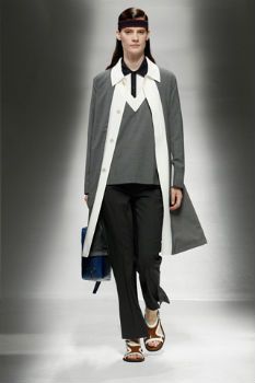
Android, from Prada's 2013 collection

Read More...

Saturday, August 11, 2012

From Schiaparelli to Prada: Deterioration of Culture


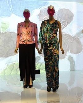
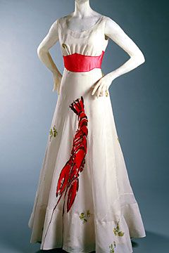
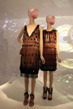
Schiaparelli's designs displayed at the Metropolitan's
Schiaparelli and "Prada: Impossible Conversations",
with the shoe-hat, the lobster dress, and other gowns.


-----------------------------------------------------------------------------------------------------

When a fashion designer says that her aim is to introduce ugliness into women's clothes, what do you do?

That is what Prada said in an imaginary dialogue she held with Schiaparelli, the "avant-garde" designer of the early twentieth century.

The "Dream Dialogue" between Schiaparelli and Prada is part of the Metropolitan Museum's "Schiaparelli & Prada, Impossible Conversations" exhibition that runs through August 19. Prada appears as her self, and Schiaparelli is reincarnated by the actress Judy Davis.

Prada is our contemporary expert on women's clothes. Her clothes are uninteresting, and their ugliness factor is more a boring lack of style than anything "shocking" the avant-gardists attempted through wit and imagination at the peak of their creativity. Prada says she is influenced by Schiaparelli's designs, and hence the exhibit (and her new line of work). But what she's really after is the rebellious essence of the early twentieth century avant-gardists. Of course, she misconstrues their efforts and intentions. They never wanted to destroy beauty, skill and culture, as do die-hard post-modernists like her.

Prada is the avant-gardist of our era, who wishes ugliness for women. That is her "shocking" contribution to her art. Not playful lobster dresses and witty shoe-hats (from the foot to the head, as Schiaparelli joked). But the telling point in Prada's conversation with Schiaparelli was not that she wishes simply ugliness for women and to discard their femininity (if these are just simple things), but that she wishes POWER for women. Power over what? Over men; over their destiny as women (the weaker sex, as she calls women); over their bodies, one of which is of course their ability to have (and NOT have, in Prada's argument) children. Prada, as with all feminists, doesn't really want equality for women, but a recreation of their person-hood. She wants to destroy the feminine woman, destroy her feminine essence and unique strength, which according to feminists is woman's weakness, then create a super creature that presides over all others, and especially over men. What feminists ultimately wish to create, although they would never admit to this, or even recognize this, is an alien creature/monster.

Schiaparelli is the better, the more talented, the more skilled, the more educated designer. Her clothes are well-crafted, her textiles well-chosen, and her designs far more superior than what Prada has to offer. Even her presence is more alluring and imaginative than the frumpy Prada. Still, there is no denying that Schiaparelli's playfulness did contribute to the decline in cultural excellence. She dismissed skill for pure imagination. Prada is ultimately her heir, who works simply with her ideas, without the finesse and skill necessary to back them up.

Prada is the supreme post-modern artist of our era. Ideas (and almost always bad, ugly ideas) are the crutch she leans on, as though things materialize out of the nether worlds of her vapid brain.

I would get Schiaparelli's "lobster dress" and "shoe-hat" any time over Prada's drab dresses.

The exhibition entrance is a suggested $25, but you can enter with a donation of any amount. The guy at the ticket booth took my "donation" of $2 with good humor. You can spend quite a bit of money at the Museum's store, with its overpriced, but one-of-a-kind items made especially for the exhibition, to make up for a lower entrance fee.

My instincts were right about Prada's feminism which leads to equality, which ultimately means power of women over nature. Here is some background on her:
As a young woman, Prada, who has a degree in political science and then studied mime with the Piccolo Teatro in Milan, was a signed-up member of the Communist Party and a reluctant inheritor of her grandfather's leather goods and glass company. She finally took the helm there in 1978.

"Italian society was becoming obsessed with consumerism, but my big dreams were of justice, equality and moral regeneration," she said. "I was a Communist but being left wing was fashionable then. I was no different from thousands of middle-class kids."
I suppose her slabs of ugly glass are some kind of homage to her grandfather Mario Prada, the founder of the Prada line. Yet a convoluted homage it is.
Mario Prada did not believe that women should have a role in business, and so he prevented female family members from entering into his company. Ironically, Mario's son harbored no interest in the business, so it was his daughter Luisa Prada who took the helm of Prada as his successor, and ran it for almost twenty years. Her own daughter, Miuccia Prada, joined the company in 1970, eventually taking over for her mother in 1978.[Source: Wikipedia]
Miu Miu may have never forgotten the second choice women in Mario's family were given to run his business. Her subconscious revenge is to scatter her works with ugly glass and crudely cut leather.

-----------------------------------------------------------------------------------------------------

Prada's convoluted homage to her grandfathers glass and leather heritage:

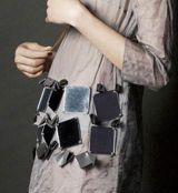
Prada's sack tunic with
what look like glass (but are
probably plastic) slabs from
the Met's exhibition.


Tunics (Roman gladiator?)
at the Met's exhibition
From Prada' s Ready-to-wear
Fall 2009
collection


(More images of the exhibition piece here.)

-----------------------------------------------------------------------------------------------------

And on those avant-gardists. All those I have met (at least the leaders) who SELL the idea of the leftist/communist/anti-establishment avant-garde are bourgeois at heart. Avant-garde is for the common people, who literally, like the advance guard in armies, are sent to the front to fight the real, deadly battles.

Here is how the Department of Defense explains the advance guard:
Detachment sent ahead of the main force to ensure its uninterrupted advance; to protect the main body against surprise; to facilitate the advance by removing obstacles and repairing roads and bridges; and to cover the deployment of the main body if it is committed to action. [Source: Department Of Defense Dictionary of Military Terms]
The common folk get the products that seep out of the distorted imaginations of these armchair avant-gardists, while they live safe and secure bourgeois lives.

That is how Prada is living her life. Her husband is the "boss" as she has arranged it. She acts as the creative force, while he runs the business and rules the staff with his boisterous personality. It is a "family" business, apparently run by the head of the household, Mr. Prada. They have two grown sons, one of whom is joining the family business.

Clever Mrs. Prada, who's kept her name, gives just enough of the reigns to her excitable husband, and sits demurely next to him when necessary.

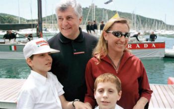
Prada with her husband in 2011

Prada with her two sons below (in 1999), forming her happy family which is still in tact. Families consisting of husband-wife-two/three kids are only for fake avant-gardists like her. Other "families" can be of any type: homosexual parents, unmarried parents, women bringing up their children alone, etc. All of these make up the foot soldiers who change the messy world below the palaces of the pradas.

Prada with her husband and two sons in 1999

Read More...

Thursday, December 22, 2011

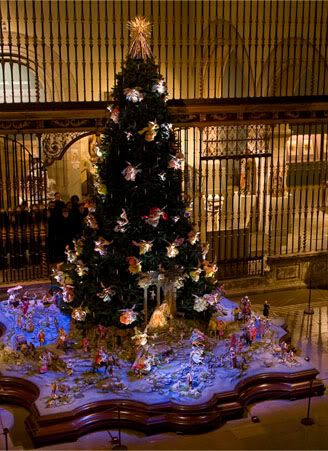
Christmas Tree at the Metropolitan Museum of Art

Christmas Tree with Neapolitan Baroque Crèche
at the Metropolitan Museum of Art, New York

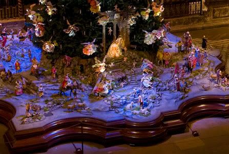
(Detail) Neapolitan Baroque Crèche at the base of Christmas Tree

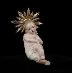
Infant Jesus by Guiseppe Sammartino (1720-1793)
From the Crèche

[All images from the Met website]

Each of the figurines under the tree is apparently created by a different artist. The baby Jesus above is by Giuseppe Sammartino (1720–1793). He is with Mary, who is under the pillars (with the cherub flying in between). Joseph is standing behind Mary.

The Metropolitan Museum website has images of 233 artworks of the tree and the crèche, which includes the figurines and some of the designs that went in their creations. The very first page has descriptions of the figurines of the holy family.

-----------------------------------------------------------------------------------------------------

It is the Christmas season, and Christmas trees are everywhere, so I cannot help but comment on them.

Despite their name change (Eaton Centre calls theirs a "Wish Tree") and odd shapes (Dundas Square - across from the Eaton Centre - has mounds of snow made of wire that make a tree), they still give a festive air to these days.

Above is a tree I saw at the Metropolitan Museum of Art, which seems to be a long-standing tradition at the museum.

It is hard to see all the pieces from the images above, but in front of the pillars are Joseph and Mary with the infant Jesus, and the various wise men (on horseback, camel, and elephant) are on either side of the family. Shepherds are there too, as well as angels. And many "ordinary folk" including "a man with bagpipes" and "girl carrying a basket of onions" amongst many others.

Here is more on the tree and the crèche from the Met's website:
The annual Christmas display is the result of the generosity, enthusiasm, and dedication of the late Loretta Hines Howard, who began collecting crèche figures in 1925 and soon after conceived the idea of combining the Roman Catholic custom of elaborate Nativity scenes with the tradition of decorated Christmas trees that had developed among the largely Protestant people of northern Europe. This unusual combination first was presented to the public in 1957, when the Metropolitan Museum initially exhibited Mrs. Howard's collection. More than two hundred eighteenth-century Neapolitan crèche figures were given to the Museum by Loretta Hines Howard starting in 1964, and they have been displayed each holiday season for nearly forty years. Linn Howard, Mrs. Howard's daughter, worked with her mother for many years on the annual installation. Since her mother's death in 1982, she has continued to create new settings for the Museum's ensemble and additional figures that she has been lending to the collection. In keeping with family tradition, Linn Howard's daughter, artist Andrea Selby Rossi, now joins her mother each year in creating the display.

Read More...

Thursday, December 15, 2011

New York and More

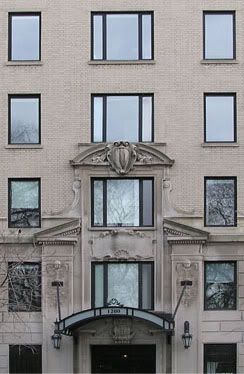
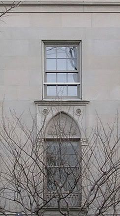
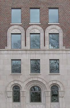
I took my trusted camera to a trip to New York City this past week-end (plus a couple more days), and shot the following photographs of facades of buildings across from Central Park, mostly along Fifth Avenue between 103rd and 96th streets. My camera's battery failed (or more like, I neglected to charge the batteries - my camera and its accessories never fail!), so I was able to take only these few photos of the countless (beautiful) buildings along the park from 103rd and beyond. I walked as far as 34th Street, to Macy's.

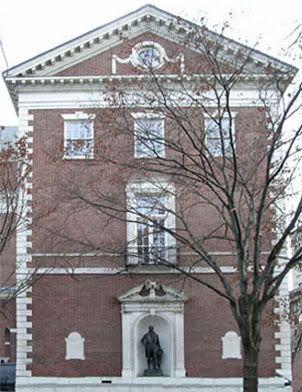
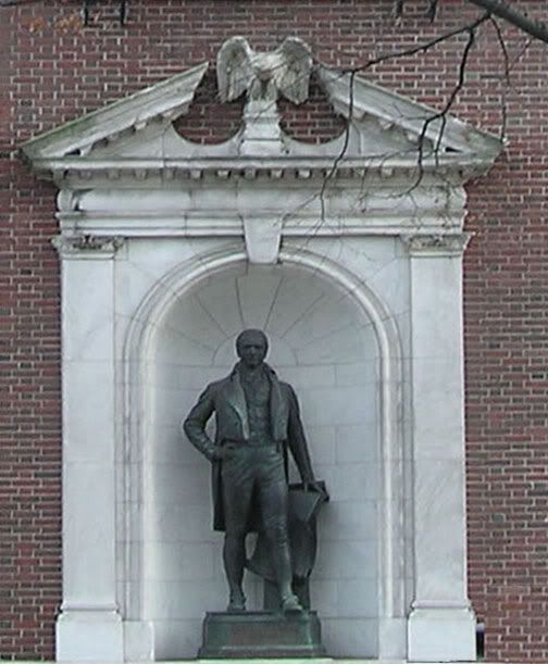
I also photographed a statue of DeWitt Clinton at the Museum of the City of New York (which I planned to visit, but which had a school group in for the morning, and was thus "closed").

DeWitt Clinton at the Museum of the City of New York


-----------------------------------------------------------------------

Facades of buildings between 103rd and 96th streets


At Macy's, I looked for the new Chanel perfume Jersey, but the shop assistant told me to go to Saks, but I passed Saks (on 44th) - the sidewalks around that area were very crowded. I continued walking up Fifth, and peeked at the Christmas tree, the angels and the skaters at the Rockefeller Center. I then walked up Madison Avenue, which I think has better boutiques than Fifth. I was pretty tired around 70th Street (despite a soft pretzel from the park, and a "mixed veggie" pizza from a takeout), and I took a bus back up to 106th, where I was staying.

Along the park, there are vendors selling paintings, mostly of New York. I found one who was selling black and white photographs (printed as postcards) of early New York. I found them on-line:

- Flatiron Building, 1907
- Looking Northwest toward Skyscrapers on East 42nd Street, 1930

[Photos by KPA]

Read More...

Wednesday, November 30, 2011

Canada: An Amalgam of Mediocrity. Part II

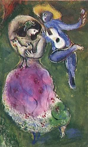
Marc Chagall
Couple de Danseurs (Dancing Pair), 1941
Gouache, watercolor, and ink on watercolor paper
16 1/2 x 10 1/4 inches
Musée National d'Art Moderne, Paris

Chagall is one of my favorite artists. I think it is the whimsy of his images, with a full range of motifs from farm animals to fiddle players, that attracts me. It is also the colors he uses, which as I wrote here, "are deep and saturated." I think there is also an exotic element of Chagall's depictions of "Russian Jewish peasantry" which I find intriguing.

The Art Gallery of Ontario has extended its Chagall exhibition "Chagall and the Russian Avant-Garde" until mid-January, with an unprecedented half-price admission on Wednesday nights. Tickets for the show are not cheap - $25 each. Half that price is a bargain.

I went yesterday to buy a ticket for this evening, to avoid the disappointment of a sold-out show. I walked into the renovated (and ugly) front part of the building to the ticket booth. The woman selling tickets asked me for my name and address. I said I wouldn't give her that private information. She said she couldn't process the ticket without it. I said I wouldn't leave without buying the ticket, but I wasn't going to give her the information. She said she'd have to call her manager.

"Fine."

The manager came.

"I'm not paying by credit card or check. There's no reason for you to have my personal information."

The manager looked me up and down, then said: "Just give it to her."

Then she turned to me and said, "There's no need to be so difficult."

"You haven't provided me with a good reason to give you that information. You are implying that I may be an art thief or something, with your treatment of me, and with your jaded reasons for taking my private, personal information. When I go to Sears and buy a coat, no-one demands that I give out such information, unless I'm paying by credit card or by check."

"You've just ruined the day."

Unbelievable.

The woman was an Ethiopian, by the large silver cross she was wearing. She had the features of the Tigray people of northern Ethiopia. She was short, and dark skinned, with short, curly dyed (brownish) hair.

I've experienced this antagonistic behavior from other Ethiopians. I always attribute it to my own features, which remind people of the late Haile Selassie (although there is no relation). They are of course the features of the Amhara group, the people that led the country for several centuries.

The bitter Mengistu Haile Mariam (thought to be the illegitimate offspring of a southern woman and her northern Amhara master) rose to unprecedented power from a mere corporal to leader of the country. He proceeded to destroy (or try to destroy) Ethiopia's historical and cultural identity, and especially the Amhara. Despite the demise of Communism (and Haile Mariam fleeing the country), the taint of Marxism is still in people's psyche, and those elitist Amhara are still to blame for all that went wrong in Ethiopia.

I think this is where this woman is coming from, since I cannot think of any other reason for her vicious interaction with me. (I get this kind of interaction from non-Amhara Ethiopians relatively frequently).

Needless to say, I bought my ticket, and wrote another one of my "To whom it may concern" letters to the administrators of the museum.

Despite this glitch, I really look forward to the exhibition, and will write a review soon.

Read More...

Sunday, November 13, 2011

Luck of the...?

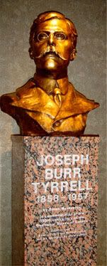
Bust of Joseph Burr Tyrrell at the
Royal Tyrrell Museum, Drumheller, Alberta
By: Danek Mozdzenski


On Saturday mornings, I work at the Cabbagetown Regent Park Museum. I've written about the museum, its history and its neighborhood here and here.

Yesterday, an elderly gentleman stopped by and gave me a check, saying that this is his donation to the museum. "You know what to do with that, don't you?" he asked politely concerned. I said, yes I do, and thank you very much. After he left, I opened the (unsealed) envelope, and was shocked to find a $500 check. I placed it carefully away, and waited for the museum supervisor to show up at the end of the morning. I gave her the check, "Five hundred dollars!" She was too busy bustling around and didn't hear me. I waited, then I interrupted her:

"Here's a donation check for five hundred dollars!"
"I thought you said five dollars!"
"No a generous, and kind, five hundred. Bye, see you next week!"

His last name is Tyrrell. I looked up Tyrrell and Cabbagetown together, and here's what I found on a Joseph Burr Tyrrell, listed under "Cabbagetown People":
Born in Weston, Ontario in 1858, he was the son of an Irish immigrant who was a successful builder. Tyrrell represented a new breed of explorer; a wilderness traveller who was also a scientist. He worked for The Geological Survey of Canada for 17 years from 1881- 1898 spending a great deal of time mapping the Northwest Territories.

His most famous discovery was of the first Dinosaur bones in the Badlands of Alberta, the largest find of its kind in North America to date.

He travelled up unmapped rivers to Fort Churchill and Dawson City, discovered coal deposits in Alberta and British Columbia and participated in the Klondike Gold Rush. He helped to develop many mines in Northern Ontario, including gold mines, and retired a wealthy man.

Later on in life he bought 600 acres of land for an apple orchard that is now the site of the Toronto Zoo. He died at 99 years of age in Toronto in 1957 having lived a full life, by any measure.
I'm not sure if this gentleman is related to this famous Tyrrell, yet it would make sense that a relative of someone listed under "Cabbagetown People" would make such a contribution. Perhaps I will solve the mystery next week.

--------------------------------------------------------------

At my job at Laura's, a middle-aged woman walked by my "zone" (each salesgirl is given an area called a zone, where she manages the customers that pass through). This customer eventually bought several hundred dollars worth of merchandize (pants, tops, cardigans, jewellery), which she said she needed both for office Christmas/winter attire, and for the holiday season in general. She says she comes in about twice a year to update her wardrobe. I told her she could wear these same clothes next year (i.e., no need to replenish her wardrobe). The store manager couldn't believe it, and it seemed like some big occasion (don't these people sell anything!?).

Read More...

Thursday, June 02, 2011

Van Cleef & Arpels: Waves and Moon Landings

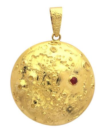
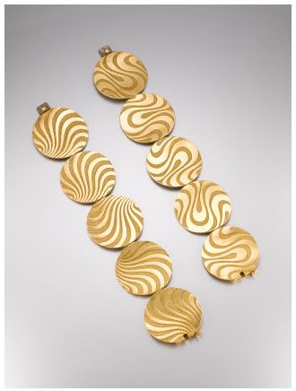
In a previous blog entry, I posted a selection of Van Cleef & Arpels jewelry from the Cooper-Hewitt exhibition, Set in Style: The Jewelry of Van Cleef & Arpels. The "Nature" and "Transformations" categories have a couple of unique designs:

Moon Landing Pendant Brooch
Is the red stone symbolic of the human
heart (presence/visit)?


---------------------------------------------------------------

Waves Bracelets
One can see the sand particles
swirling under the water.
(Larger image here)


Read More...

Wednesday, June 01, 2011

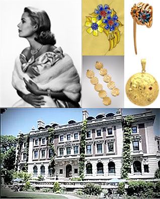
Van Cleef & Arpels

Set in Style: The Jewelry of Van Cleef & Arpels (through July 4)
at the Cooper-Hewitt National Design Museum

Make sure to check all the links on the Van Cleef & Arpels exhibition pages (Video, Innovation, Transformations, Nature, etc.) to view selected items. The last time I was in New York, the Cooper-Hewitt was beginning a major construction project. It was impressive to visit the Andrew Carnegie Mansion, which is the museum's main building. It looks like parts of the museum are in full function with the Van Cleef & Arpels exhibition. The renovations should be completed by 2013.

Cooper-Hewitt Re: Design
Video on the renovation plans


Read More...

Tuesday, September 21, 2010

An Inferior (Photographic) Reproduction

Of Madame X

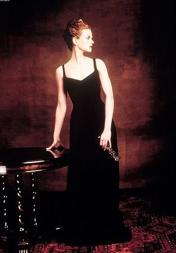
Left: Nicole Kidman as Madame X
Right: The original Madame X - Virginie Amélie Avegno Gautreau,
an American socialite married to a French banker

The October 2010 issue of Vogue is promoting a new book: The World in Vogue: People, Parties, Places, and put a sampler of two portraits of famous women. One is American painter John Singer Sargent's Madam X, which he painted in 1884. Another is a reprint of actress Nicole Kidman posing as a Sargent woman, and Madam X in particular, taken by Vogue photographer Steven Meisel for the June 1999 issue of Vogue.

Sargent's Madame X exudes confidence by the full twist of her body, as though ignoring the painter, and the way she holds her head high. Her presence is appealing with her tightly clinched waist, and a dress with a well-defined bodice and of fine satin material.

Kidman, on the other hand, cannot seem to decide whether to turn away or toward the photographer, and she has those "eyes glaring at headlights" look that she conveys in many of her photos and films. (I always wonder why she is such a popular actress, with such a meek presence). The cut of her dress is not nearly as sophisticated as Madam X's, and it is not clear what the material the dress is made from, although it looks like a heavy and unattractive velvet. And it could just be the web and magazine reprint, but the light behind her is unforgiving and harsh, bringing up too much of a contrast in her skin, and giving it an unattractive reddish glow. Even the table she is leaning on is overbearing, unlike the elegant circular form which is behind Madam X, and whose curves mimic her delicate waistline.

The article in Vogue describes a new exhibition on view at the Fenimore Art Museum in Cooperstown, New York. The museum's website has a few images from the exhibition, including a sketch of Madame X by Sargent.

Read More...

Saturday, October 24, 2009

From MAD Designers to the Public's Desires

There is hope yet for design

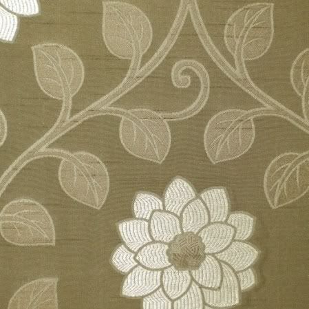
An example of an abstracted textile print,
often of unidentifiable flora and foliage,
popular at Kravitz, a NYDC showroom.


I visited the New York Design Center's trade showrooms while in NYC. They are the places to find the latest trends in fabric and interior design. But the question, which becomes a chicken or egg one, is: "Who sets the trends these days, the designers, or the clients and public at large?"

Until the 1970s, interior design has always paid respect to beauty (or mere prettiness) and craftsmanship. I was struck by this when I did my tour of the newly renovated American Wing's Period Rooms at the Metropolitan Museum. Here is what I had to say about that visit:
* Design, and fabric design, have always been about aesthetics, at times mere prettiness, at other times overwhelming luxury and sometimes just pure beauty.

* I felt going throughout the Period Rooms, which showcased about twenty rooms dating from the late seventeenth century to the early twentieth century, that people then had the confidence to design strong, beautiful pieces. Unlike our own period, whose gloomy designs I think begin around the 1970s - but more on that later.

* Craftsmanship was very important, but for the sake of constructing a harmonious, coherent piece.

* Color, intricate designs, patterns and other ornamentations were always present. There was hardly ever a "plain" chair, and if it existed, it was embellished by careful caning and weaving or luxurious materials like velvet.

* Looking at these rooms, there was nothing repellent about them, nothing "edgy." They were meant to be lived in, to be admired, and to be sources of pride for their owners.
While in New York, I also visited the Museum of Art and Design, which at that time had an exhibition of selected works from its permanent collections. This exhibition was called Permanently MAD – which was meant to be a pun, or something, but ended up truer than expected.

Permanantly MAD's displayed works included clay, glass, wood, metal, and fiber pieces. Although MAD has works in its collections from 1895 on, this exhibition showed pieces mostly from 1980-2008. These works are for the most part of inferior craftsmanship, without concern for aesthetics, and often non-functional. The whole purpose of design for MAD’s fabric designers is: a) self-expression - they consider themselves more artists than designers/craftsmen; b) innovation, since they want to discover that next, magical composition for the ideal thread. Therefore the public is of less importance.

So, if artist/designers don’t really care about their public and the real world, and they are much more interested in experimentation and self-expression, what happens to the products? As I’ve discovered, they suffer a great deal.

How does this tie in with the NYDC? Well, textile and interior design is created by…textile and interior designers. If designers are more interested in expressing themselves, which often results with ugly, idiosyncratic pieces, and in trying to invent the next magical golden thread, when do they find the time to design things?

The answer is: they don’t. And this was dismally visible at the display of material I found at the NYDC.
* There were very few intricately designed works, such as I saw plenty of in the Period Rooms at the Met.

* Although natural floral and plant designs were prominent, most of them were abstracted or extremely simplified and silhouetted forms.

* It was hard to distinguish what these plant and animal forms were. Unless they were distinct shapes like palm trees or roses, it was difficult to identify specific plants or flowers.

* Colors were often unimaginative and monotonous. There were whole ranges of grey/blues or brown/tans. But the more vigorous colors such as I found in the Period Rooms were rare.

* Where there was strong color, it was used as a single splash in the midst of greys, blacks, navies and whites. Strong colors were rarely used on their own.

* The lack of intricate design was often compensated for by size. Large empty flowers and leaves, often with a smattering of color, dominated both furniture upholstery and wall coverings.

* There were traditional designs, but they were almost exact replicas of past masters.

* Luxury materials such as silk and velvet often tried to make up for the lack of design.
My conclusion is that it is the designers (or the lack thereof) that have guided the trends and tastes of the public so far. If there is nothing but greys and blacks to buy, well the public has no choice but to comply. And so much for innovation; creativity in design has nose-dived in the past four or five decades, and is incomparable to the turn of the century and even going back another four or five hundred years!

But, there is a positive note to all this. There is a creeping realization by some – I’m not sure if it is the public demanding so, or concerned designers – that beauty should indeed be part of home decor and design, and that good designs are worth the effort. There is a tendency to avoid chaotic, incomprehensible and disordered patterns. Floral and leaf designs are coming back. Old masterpieces (as in Toile de Jouy) are imitated with contemporary twists. And color is making a tentative reappearance. People cannot (will not) live in dark, ugly rooms for eternity.

Read More...

Monday, October 12, 2009

Exquiste Design

All for a chair

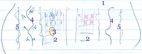
Below is a very rough sketch I did on my lined paper in blue ink as I was going through the Period Rooms (there is a very good summary at the link provided, including photographs) in the newly completed American Wing of the Metropolitan Museum of Art. The sketch is of the seat of an upholstered chair of the "neoclassical" period, and unfortunately I cannot find an image of it in the Met's vast online database.

I drew it because it characterized many things for me.

* Design, and fabric design, has always been about aesthetics, at times mere prettiness, at other times overwhelming luxury and sometimes just pure beauty.

* I felt going throughout the Period Rooms, which showcased about twenty rooms dating from the late seventeenth century to the early twentieth century, that people then had the confidence to design strong, beautiful pieces. Unlike our own period, whose gloomy designs I think begin around the 1970s - but more on that later.

* Craftsmanship was very important, but for the sake of constructing a harmonious, coherent piece.

* Color, intricate designs, patterns and other ornamentations were always present. There was hardly ever a "plain" chair, and if it existed, it was embellished by careful caning and weaving or luxurious materials like velvet.

* Looking at these rooms, there was nothing repellent about them, nothing "edgy." They were meant to be lived in, to be admired, and to be sources of pride for their owners.

Sketch of the upholstered seat of a "neoclassical" chair of the late eighteenth century.

This small chair, hidden in a side room besides the "neoclassical" section, got my attention right away. This was a chair that was certainly not kept as a piece of art, but merely as a household furniture to keep a person comfortably seated, a person who probably only briefly glanced at it before sitting down. Yet so much attention was paid its design.

There are several design elements going on at once in the upholstery:

1. The background color of the upholstery is a creamy, ivory white.

2. There is a checkered pattern near the middle – where alternate squares are colored in pale pink so the overall middle section is dominated by this pale pink.

3. The outlines of gold flowers were embroidered on top of these checkers.

4. Realistic vines and leaves, were embroidered in the spaces to the right and left of the checkers, in variations of greens and browns – adding shading and texture to the vines and leaves.

5. On either side of the vines, were curved lines, embroidered again in gold.

6. The stripes were all done in greyish/silver to offset against the ivory white of the background.

So there was a mixture of: stylized flowers and realistic vines with leaves; straight and curved lines; and checkered squares filled alternately with delicate color. Such rich design, done with the utmost delicacy to harmonize everything together on a seat!

Of course this all didn’t come out of nowhere. In the room adjacent to this exquisite chair – notwithstanding my inadequate sketch! – two of the big three 18th century furniture designers’ books were cited:

George Hepplewhite’s Cabinet-maker and upholsterer’s guide (1788)
Thomas Sheraton’s Cabinet-maker and upholsterer’s drawing book (1793)

The third big name was Thomas Chippendale.

Read More...

Friday, October 09, 2009

Vermeer's Light and Movement

A precursor to cinema?

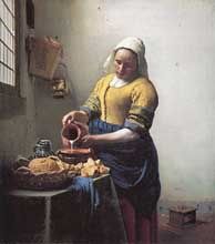
The Milkmaid, 1657–58

At one point, Vermeer was my favorite painter. I still think he's magnificent - although that is not really the word used to describe the quiet and almost serene paintings.

I was able to see The Milk Maid at the Metropolitan Museum of Art in New York. The painting was on loan from Holland's Rijksmuseum, to commemorate the 400th anniversary of Henry Hudson's voyage from Amsterdam to Manhattan. The museum's other five paintings by Vermeer were also on display, as well as paintings by Dutch artists who were contemporaries of Vermeer.

I won't say much about this painting, since I really had a just few minutes (maybe three) in front of it, since the gallery was so crowded. So, I will only write of my impressions.

As always, with Vermeer, I am struck by the light surrounding many of his subjects. This is a diffuse, all-over light, which illuminates them delicately, unlike the dramatic flashes that Rembrandt uses. Another thing that strikes me about these paintings (portraits, more like) is that they almost appear as though the subjects are moving, but not just performing their task, but moving (or about to move) their heads as though in contemplation. The milk maid stands with her jug ready to pour the milk, but at the same time, she could turn her head to look out of the window maybe to look for someone, or wishing she were outside.

I have done two pieces on Vermeer. One is an article, which I wrote sometime in 2006 (unpublished) which I called Vermeer's Discerning Light, an expository piece on this diffuse, gently illuminating light that Vermeer uses. You can read it hear.

The other is a short animation I did of The Lacemaker, again partly a contemplative piece, and partly a piece about this lacemaker’s task (although in the final version, I opted not to include movements of her hands working on the lace). The animation was done with Photoshop, then in a film editing software called Premier.

The Lacemaker, 2000

So, light and movement - a precursor to cinema, all those centuries ago.

Read More...

Sunday, September 21, 2008

Hirst Update

Pickled eternity


Here is an article by Robert Hughes going into detail about Damien Hirst's attempt at broaching the Big Ideas in art. I wrote about his religious/Christian references. Hughes talks about Hirst's attempts at fatuous (Hughes' word) referencing: Nature and Death amongst others.

One could also add Eternity to the list, considering Hirst likes to pickle his animals in formaldehyde. But then again, his pieces are either beginning to rot, or to leak their formaldehyde. I suppose this could be a type of conceptual piece that Hirst and his museum collectors could exploit.

It could be called The Five Sensations of Death: Sight, Sound -[ of trickling liquid], Smell - [of rot], Touch, and Taste - [Hirst's concotion of his dead animals on the museum's heating system].

Hirst would just have to be creative on how to make his millions out of a piece that could potentially no longer exist. Oh wait, he's doing that already!


Read More...

Saturday, August 16, 2008

The New Vitruvian Man

And vying for supremacy


The Perfect New Man


I superimposed a photo of Michael Phelps over Leonardo's Vitruvian Man. Phelps's left arm, and the left side of his body, is facing slightly backwards in the photo, making the superimposition imperfect. I'm certain if we could get a full frontal pose, it would be close-to-perfect.

[Update: I will try to do the calculations to see if the Vitruvian Man and Phelps do indeed match. We have the numbers for Phelps's proportions, I'll look for Leonardo's].


But, it is still alarming how well Michael Phelps's body superimposes over the Vitruvian Man. His last competition, where he won the 100-meter butterfly by 1/100 of a second, is being replayed over and over. Some are calling it luck. I think there is a mental activity going on during the race. Phelps himself said he had to make a micro-second decision whether to coast to the finish, or to add an extra stroke to pull himself to the wall. This is all taking place in micro-seconds! He chose the latter, and the rest is history.

This very interesting discussion came up at the View from the Right just after I composed this post on Phelps.

The Karma of Canada's Olympic Costumes


I wrote a long article (which I sent to 37 Ontario papers and three national ones, and only got a first response from two) on the dismal choices the Canadian Olympics uniform design team made. Besides a really unsightly pattern, which makes some of the clothing look like pajamas, I was distressed at how the designers used mostly Chinese symbols and lucky charms on the clothing that Canadian athletes would wear to compete against those very same Chinese. I ominously wrote:
Our Canadian athletes have now the added burden of warding-off the mixed signals their clothing gives them. If there ever was an unlucky charm, it would have to be their costume, which drains the Canadianness out of the athletes and infuses them with their competitor’s spells.
Well, this is already day eight, and only three medals from the Canadian team. Smaller countries such as Great Britain and France are already amassing medals in the high teens and twenties. Symbols mean something, and if sport's competitors are so willing to accept those from alien nations (their rivals!), then their whole attitudes towards sports, winning, and bringing back glory to their nation is in question.

Something is seriously wrong here.

Chinese invisible intimidation?

Alicia being comforted by the more immune Shawn for her misses

Once again, images speak more than words. Alicia Sacramone, the older team leader of the American women's gymnastics team, has been in a bad humor throughout this competition. She's a more emotional gymnast, unlike the rigidly self-controlling Nastia Liukin, and the easy-going, but focussed Shawn Johnson. Her photo and video shots constantly show her with bewildered eyes, and nervous glances. What could have set her off?

Well for starters, there is the the possibility (probability?) of under-age Chinese competitors. There is also the aggressive declaration of the Chinese that they are out to get gold for "the glory of the motherland."

This, added with the strange, combative, even hostile, faces of the Chinese athletes I blogged about earlier, must have had its toll.

I think Sacramone is reacting to a general malaise, which she couldn't pin-down. She even blamed herself for her misses which cost her team their gold. Her team's coach, though, has said that Alicia was made to wait an inordinately long time before her performance as a "psychological warfare" by the Chinese to disarm her.

So, is this what we are to expect from the Chinese? Ambiguously aggressive faces, "we'll get yous" behind smiling faces, outright deception and lies? I think we should paying attention to the Alicias of the world, who for some reason seem to have a high detection - or at least, reaction - level for those apparently invisible signs of hostility.

The subjective rankings of Canadian Idol - sounds like the Olympics gymnastics

Amberly is heading home. I think she would have sung some lovely Beatles' songs booked for next week's show. But, it is a tight race, and her last performance was flat and strained. She had been practicing with her guitar, and I think she missed it during the performance.

But, the big news is still Mookie. And he's as unconvincing as ever. I think he's trying for a Billy Idol-Iggy Pop and, as his last song choice showed, the bad boys of the sixties all meshed in one. Billy Idol and Iggy Pop actually have very good voices, and with quite a wide range, unlike Mookie. They were able to sing great ballads, as well as their more "wilder" songs.

Mookie's strange rhythmic exercise (2min17 point) on "close your eyes girl" were distracting
(here is the original from Steppenwolf), making me doubt those abilities too; he's done this in another song.

But the worst is bringing in the DJ with the turntable, as in rock-turns-house. I expect Mookie will start milking all these multi-culti, fusion variations to make up for his lack of vocal talent. And yes, he's already a Superstar, according to Sass Jordan, who had nothing to qualify that statement with.

So, what's my point? I still think that Canadians are being taken for a ride by the "experts." Like the Olympics costume debacle, they are taken in by a flashy exterior and ignore more subtle and enduring skills. There is a general laziness and willingness to go for quick gratifications that is in the process of ruining the arts, whether they be in
music, architecture, design, and television shows.


How does one conquer the brute force of Russia?

The State Hermitage Museum, in St. Petersburg, Russia

Almost everyone is talking and writing about Russia's craze for power, her return to the Cold War mentality, how the West should handle this brute force that is Russia, a brute force much like what she had been throughout her history - Soviet era, 19th century expansion, the time of the Tsars, you name it. Russia becomes synonymous with civilization destroyer.

So, how about the centuries old Hermitage Museum? The original building was designed following the Versailles Palace of France, under the direction of Peter the Great, who built his whole city - St. Petersburg - using European models and architects. Later on, Catherine the Great started her great collection of European art there, which continues to this day.

Catherine the Great also corresponded for years with French philosopher Voltaire, although his Enlightenment ideas don't necessarily show themselves in her reign. French, rather than Russian, was the language of the Russian aristocrats throughout the nineteenth century, and many Russians looked to Western Europe and France for culture and the arts.

Brute force and civilization destroyer, indeed.


Read More...