There is hope yet for design
 |
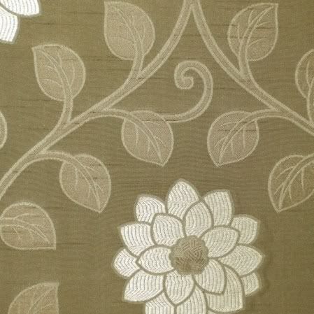
often of unidentifiable flora and foliage,
popular at Kravitz, a NYDC showroom.
I visited the New York Design Center's trade showrooms while in NYC. They are the places to find the latest trends in fabric and interior design. But the question, which becomes a chicken or egg one, is: "Who sets the trends these days, the designers, or the clients and public at large?"
Until the 1970s, interior design has always paid respect to beauty (or mere prettiness) and craftsmanship. I was struck by this when I did my tour of the newly renovated American Wing's Period Rooms at the Metropolitan Museum. Here is what I had to say about that visit:
* Design, and fabric design, have always been about aesthetics, at times mere prettiness, at other times overwhelming luxury and sometimes just pure beauty.While in New York, I also visited the Museum of Art and Design, which at that time had an exhibition of selected works from its permanent collections. This exhibition was called Permanently MAD – which was meant to be a pun, or something, but ended up truer than expected.
* I felt going throughout the Period Rooms, which showcased about twenty rooms dating from the late seventeenth century to the early twentieth century, that people then had the confidence to design strong, beautiful pieces. Unlike our own period, whose gloomy designs I think begin around the 1970s - but more on that later.
* Craftsmanship was very important, but for the sake of constructing a harmonious, coherent piece.
* Color, intricate designs, patterns and other ornamentations were always present. There was hardly ever a "plain" chair, and if it existed, it was embellished by careful caning and weaving or luxurious materials like velvet.
* Looking at these rooms, there was nothing repellent about them, nothing "edgy." They were meant to be lived in, to be admired, and to be sources of pride for their owners.
Permanantly MAD's displayed works included clay, glass, wood, metal, and fiber pieces. Although MAD has works in its collections from 1895 on, this exhibition showed pieces mostly from 1980-2008. These works are for the most part of inferior craftsmanship, without concern for aesthetics, and often non-functional. The whole purpose of design for MAD’s fabric designers is: a) self-expression - they consider themselves more artists than designers/craftsmen; b) innovation, since they want to discover that next, magical composition for the ideal thread. Therefore the public is of less importance.
So, if artist/designers don’t really care about their public and the real world, and they are much more interested in experimentation and self-expression, what happens to the products? As I’ve discovered, they suffer a great deal.
How does this tie in with the NYDC? Well, textile and interior design is created by…textile and interior designers. If designers are more interested in expressing themselves, which often results with ugly, idiosyncratic pieces, and in trying to invent the next magical golden thread, when do they find the time to design things?
The answer is: they don’t. And this was dismally visible at the display of material I found at the NYDC.
* There were very few intricately designed works, such as I saw plenty of in the Period Rooms at the Met.My conclusion is that it is the designers (or the lack thereof) that have guided the trends and tastes of the public so far. If there is nothing but greys and blacks to buy, well the public has no choice but to comply. And so much for innovation; creativity in design has nose-dived in the past four or five decades, and is incomparable to the turn of the century and even going back another four or five hundred years!
* Although natural floral and plant designs were prominent, most of them were abstracted or extremely simplified and silhouetted forms.
* It was hard to distinguish what these plant and animal forms were. Unless they were distinct shapes like palm trees or roses, it was difficult to identify specific plants or flowers.
* Colors were often unimaginative and monotonous. There were whole ranges of grey/blues or brown/tans. But the more vigorous colors such as I found in the Period Rooms were rare.
* Where there was strong color, it was used as a single splash in the midst of greys, blacks, navies and whites. Strong colors were rarely used on their own.
* The lack of intricate design was often compensated for by size. Large empty flowers and leaves, often with a smattering of color, dominated both furniture upholstery and wall coverings.
* There were traditional designs, but they were almost exact replicas of past masters.
* Luxury materials such as silk and velvet often tried to make up for the lack of design.
But, there is a positive note to all this. There is a creeping realization by some – I’m not sure if it is the public demanding so, or concerned designers – that beauty should indeed be part of home decor and design, and that good designs are worth the effort. There is a tendency to avoid chaotic, incomprehensible and disordered patterns. Floral and leaf designs are coming back. Old masterpieces (as in Toile de Jouy) are imitated with contemporary twists. And color is making a tentative reappearance. People cannot (will not) live in dark, ugly rooms for eternity.


