Showing posts with label Painting. Show all posts

Friday, August 24, 2012

La Dentellière and the Lacemaker


La Dentellière is a hard film to take. It was showing recently on the French channel Télévision Français de l'Ontario (TFO), which is the french version of TVO, Television Ontario, last night. I hesitated to watch it, since I knew it would be a sad film to watch.

The lovely Isabelle Huppert is a young actress in this film.

I didn't get the connection between the film and the painting until the very end. Huppert turns her head and looks at us, the audience. It's the culmination of the many things her character, Pomme (her nickname which means "Apple" because of her round face), has gone through.

I've written about the uncontrollable desire to animate Vermeer's paintings, as though their stillness is some kind of suspended animation (or life). I've noticed that many artists feel the same way. Most, though, make small animated spurts of the actual painting. Claude Goretta, who directed La Dentellière, creates a whole story behind The Lacemaker. He brings the painting to life both through animation and through story, and creates a new character to embody her.

The film is from the novel La Dentellière by Pascal Lainé, who writes of Pomme:
She was like one of those genre paintings where the subject is captured in mid-movement. Her way, for example, of pursing hairpins in her lips as she redid her hair bun! She was The Laundress, The Water Girl, or The Lacemaker.
He is, of course, talking about Vermeer, after whose Lacemaker he titles his book.
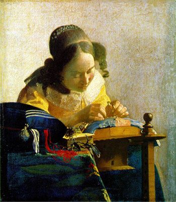
Vermeer, Jan
The Lacemaker
c. 1669-1670
Oil on canvas transferred to panel
23.9 x 20.5 cm (9 13/32 x 8 1/2 in.)


It was fun to see Paris in the seventies, but most of the film takes place in the northern seaside resort of Cabourg. This is partly a story about sexual liberation, and the societal responsibilities (or irresponsibilities, more like) that followed from that era. A lovely, delicate girl like Pomme, again an apt name because she does look as lovely, fresh and round-faced as an apple, would have probably got a lot of protection from her mother and especially her male family members in per-feminist eras. "Elle est fragile," says Pomme's friend, who brought her to Cabourg for a short vacation, but has no time for the especially vulnerable Pomme. She probably brought her along on vacation to help with the hotel bills.
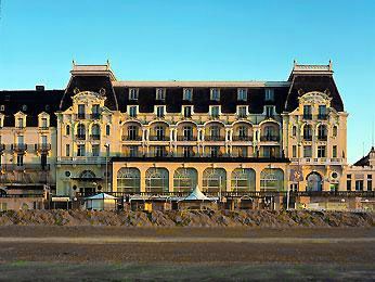
The Grand Hotel de Cabourg, where Pomme would sit
at their outdoor cafe with her chocolate ice cream
and a view of the Atlantic


Under normal family protection, some Don Juan wouldn't have been able to walk through the door, decide that he likes what he sees, and try to seduce (if he moves too fast, she might fly away) a young girl, without everyone making sure of his true intentions (i.e. marriage). That is what François, the young man Pomme meets on her trip to the seaside, tried to do.

Pomme was adept in many ways, although she would probably be considered a little slow. She works in a hair salon (mostly doing the hair of "vielle dames" as she explains), could manage many daily tasks well, and she maneuvers her way around Paris without difficulty. She is a respite for her young seducer, a University literature student full of ideas of romance, from the harsh feminists that surround him daily. I think that men are tired of feminists and feminism, even though many liberal men are staunch supporters of feminism. When it hits their daily life and choices, I am sure they would go for a gentler soul like Pomme. François realizes too late that he really was dealing with a vulnerable soul, and his clumsy attempts at seduction worked because Pomme really did like him, and trust him (he was different from the boys who whistle at her in the Paris streets). But, after he sleeps with her, he loses interest, or more precisely, he realizes he was dealing with not a savvy city girl, but a fragile, pure, soul he couldn't protect (or love). Pomme, uncharacteristically, had already told him she loved him after their night together, and it was too much for him to handle.
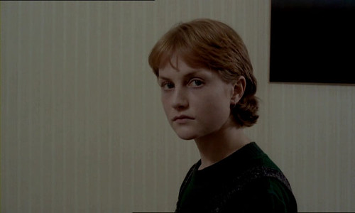

Huppert, in the still above from La Dentellière, has an uncanny resemblance to the woman in Vermeer's painting.
------------------------------------------------------------------------------------------------------

Here is an article I wrote on Vermeer:
Vermeer's Discerning Light

And here is a blog post I wrote on the desire to animate Vermeer's works:
Vermeer's Light and Movement

In the blog, I've posted a very short animation I made of The Lacemaker. I've also made a box with the face of the lacemaker printed on fabric and stretched on the outer and inner lid of the box. The outer lid is a re-print of the original Vermeer painting. When opened, the inner lid shows a photoshopped version of the lacemaker, with her eyes up and looking out at us. The outer cover is of browinsh/yellowish hue, similar to the hues of the original painting. The inner is a light (celestial?) blue.
Read More...

Tuesday, July 31, 2012

A Hierarchy of Bouquets

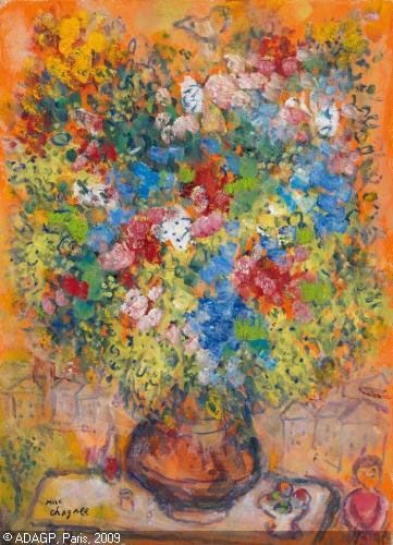
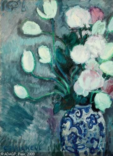
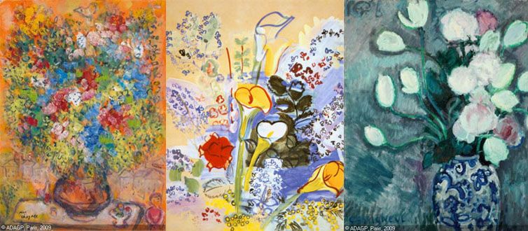
Left: Marc Chagall, Bouquet sur Fond Orange, ca. 1975
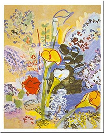
Middle: Raoul Dufy, Le Bouquet d'Arums, 193)
Right: Jean-Pierre Cassigneul, Bouquet de Fleurs, 1968

Larger images:
- Marc Chagall's Bouquet sur Fond Orange
- Raoul Dufy's Le Bouquet d'Arums
- Jean-Pierre Cassigneul's Bouquet de Fleurs

------------------------------------------------------------------------------------------------------

I've found similarities between Chagall, Dufy and Cassigneul (see my posts on their paintings here, here and here). But, like everything in art, there is a hierarchy. It goes:

First: Chagall
Second: Dufy
Last: Cassigneul

1. Chagall's Bouquet sur Fond Orange is an explosion of colors. But his painting is much more organized and structured than it seems. For example, he has divided his color blocks into three: floral sections of violet/blue and red/pink, and green/yellow leaves. The orange, which is reflected in the brownish pot, is the glow of light which illuminates the forms. Being Chagall, he cannot help but add in his village/town life, a glance at civilization. This painting is about an arranged, designed vase of flowers, not flower growing in the wild. Homes line the painting's background, and a fruit tree, another form of civilization, stands next to the table with the flowers. His bouquet dwarfs other items on the table, and rightly so since it is the most important item in the painting. It dwarfs a bowl of fruit and what look like a bottle of wine and a glass filled with wine, and a salt or pepper shaker. A miniature women dressed in red stands by the table. Clearly, the subject of the painting is the bouquet, and not her.

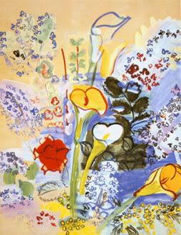
2. Next in hierarchy are Dufy's whimsical flowers in Le Bouquet d'Arums. Dark red and black ink trace the forms of calla lilies, leaves and small floral shapes, which are covered with strokes of colors. These colors are suggested rather than filling the forms with exactitude. The red flower could be a carnation: the lilac and purple of small flowers, the yellow and white of the lilies, and dark green for leaves. Rather than result with an unfinished effect, this evokes whimsy and delicacy, where shapes float in colors, and colors never completely define, or constrain shapes.

3. Finally Cassigneul's Bouquet de Fleurs. I tried looking for flowers without the perennial silent woman that fills his works, but could find only a few. I couldn't find any of the joyful, colorful renditions of bouquets that Chagall and Dufy paint. Instead, this was the best I could find. As always with Cassigneul, there is a lack of form. The tulips and roses are a blurred and shapeless, and the leaves blend into the background wall. Dufy's quasi-unfinished forms give us whimsy; Cassigneul's just look unfinished. This is because Cassigneul doesn't draw, but rather paints spots of color to form his shapes. His pot is the most elaborate of the three paintings, but it distracts from the flowers. Chagall left his pot without patterns. Dufy's callas could be in a garden, or in a vase that is below the paintings frame. Cassingeul pot is covered with an unidentifiable pattern his pot, which add a further layer of confusion. As always with Cassigneul, I feel that he is a clever painter, but not a very talented one.

And when we put him alongside the other two, we can see his limitations even more.

Art these days lacks a critical approach, partly because of the attitude that "everyone is an artist, don't you know," and a disrespect for art history and all our predecessors. We seem intent on working with a clean memory slate.

And modern art is all about deconstructing, then reconstructing. This is great if you were born about seventy-five years ago, where there were great works to deconstruct (and reconstruct, in your fashion). What we have now is an already diluted, deconstructed art, several generations down the masterpiece line. What can we deconstruct? The deconstructed pieces? This, of course, resulted with the famous empty canvasses that hang on museum walls, to the amusement of the unsuspecting public. Now, we just works that are dredged from an empty imagination, since there is nothing left that is worthy enough to guide us.

Read More...

Monday, June 18, 2012

"Le Tout New York on a Cubist Horse"


After my run through of the Picasso exhibition at the AGO, which I wrote briefly about here, and which I will expand upon soon, I remember reading a scathing article/book/review of his work, namely that his talent as a painter was negligible, and that he didn't have much of a training. I thought it was Roger Scruton (whose book Beauty I recently bought and will review in full soon) who wrote it, or possibly Kenneth Clark in his book Civilization, which I also have.

Looking online, I found this interview of Tom Wolfe by National Endowment for the Humanities chairman Bruce Cole, where Wolfe states that Picasso didn't have the training nor the skills of an artist. Below is part of the interview:
Cole: Since Picasso, the hallmark of great art has been originality, which was certainly not the case in the preceding periods. Since everyone is original now, how do you know who is original? There are no boundaries anymore.

Wolfe: Well, the art world decides for you. That's, that's really what happens. Tom Stoppard in his play, Artist Descending a Staircase, has one of his characters say that imagination without skill gives us modern art.

Cole: I do think you're seeing a return to the object and the figure. But my question is can you ever put it back together again after artists have really seen things in different ways?

Wolfe: Often the artists simply have not been taught. They don't know enough about draftsmanship to do it. They don't know enough about color. They don't know enough about light and shadow. You can see a lot of it in Picasso.

Picasso left art school at the age of fifteen, on the grounds there was nothing more they could teach him. This is extolled in biographies of Picasso. Unfortunately, he never learned perspective. In his realistic period, early in his life, there's never a room with perspective. He puts a figure or two and a stick of furniture in the foreground, and everything beyond them is fog. He never really learned anatomy. In many of his realistic pictures, fingers and thumbs are like a bunch of asparagus that you buy in the grocery store. He was never very good on things like foreshortening. If I were as ill-prepared as Picasso or Braque I would have thought up a name like Cubism, too, as a way of legitimizing one's lack of skill.
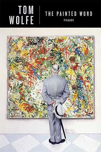
I think that the book I'm looking for is Tom Wolfe's The Painted Word, with the sections on Picasso. Below are the chapters of the book:
Chapter I: The Apache Dance
Chapter II: The Public is Not Invited (and Never has Been)
Chapter III: Le Tout New York on a Cubist Horse
Chapter IV: Greenberg, Rosenberg & Flat
Chapter V: Hello, Steinberg…
Chapter VI: Up the Fundamental Aperture
I will get a hold of The Painted Word (which I thought I had in my book collection) to re-read and to review.

Read More...

Monday, May 07, 2012

How to Wear a $990 T-Shirt


A spiteful blogger at the Washington Post writes:
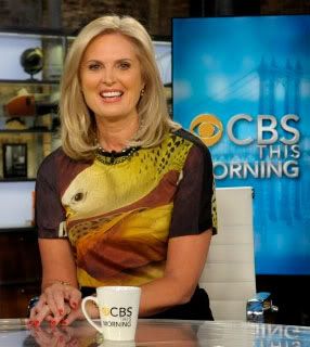
Ann Romney has been coming under fire for wearing a $990 Reed Krakoff t-shirt on the air recently. Never mind that Reed Krakoff sounds like a rejected Hunger Games character. This is a Serious National Issue.
My biggest objection to the shirt is that it looked like a disembodied fish-bird was squinting at you off Ann Romney’s right shoulder.

That is a nightmarish vision with which I would as soon not contend. That someone would pay this amount of money so that a disgruntled yellow creature could give TV audiences the stink-eye is the sort of thing that makes even the staunchest Reaganian rethink his stance on trickle-down economics.
Of course, this comment is directed at the "99%" who cannot afford $990 silk shirts. In the usual fascistic and dogmatic manner of liberals, everyone has to wear the $9 t-shirt that caters to the lowest common denominator. And all those who can afford to buy $990 t-shirts have to hand out their money to those who somehow got behind in buying designer shirts, and wear the $9 t-shirt uniform in solidarity. Never mind those 1% (i.e. the Romneys) who bought their shirts with their hard-earned money.

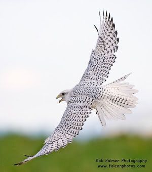
Never mind that the t-shirt (or silk shirt, as what it really is) has a print of John James Aududon's Gyrfalcon, which is an illustration of a large falcon native to North America.

Audubon's book of illustrations, Birds of America, was an ambitious project of,
435 hand-colored, life-size prints of 497 [North American] bird species, made from engraved copper plates...[which] contains just over 700 North American bird species.
The books also features the gyrfalcon.

So how "un-American" can Ann Romney be, with her instinctive ability to wear a shirt featuring an American illustrator's American bird, while accompanying her husband on a campaign interview at CBS This Morning a few days ago? Michelle Obama also likes to wear large prints, yet I have never found any of hers to have cultrual significance other than to promote "designers of color."

That said, Reed Krakoff, the designer who created Ann Romney's shirt, took the liberty of adding extra colors to the print on Ann Romeny's shirt, since Audubon's bird is mostly white, black and with touches of color, as are the colors of the actual bird. Krakoff's website says:
The bird painting was inspired by John James Audubon' s iconic painting of gyrfalcons, recolored and manipulated to a larger-than-life scale for a bold and modern effect.
Detail of Reed Krakoff's gyrfalcon

Still, good design is a reinterpretation of what is out there to fit the item on which it is displayed (a piece of clothing, a furniture), and I'm sure Audubon would have found it an honor to be part of American political history.

Gyrfalcon
By John James Audubon (1785-1851)
From: The Birds of America; from original
drawings by John James Audubon

Publication date 1827 - 1838

About the gyrfalcon:
The Gyrfalcon is dispersed throughout much of the Northern Hemisphere, with populations in Northern America, Greenland, and Northern Europe. Its plumage varies with location, with birds being coloured from all-white to dark brown.

The bird's common name comes from French gerfaucon; in medieval Latin it is gyrofalco. The first part of the word may come from Old High German gîr (cf. modern German Geier) for "vulture", referring to its size compared to other falcons; or from the Latin gȳrus for "circle" or "curved path"—from the species' circling as it searches for prey, distinct from the hunting of other falcons in its range. The male Gyrfalcon is called a gyrkin in falconry. The scientific name is composed of the Latin term for a falcon, Falco, and for a countryside-dweller, rusticolus. (More here)

Read More...

Wednesday, April 25, 2012

Dufy's Beauty

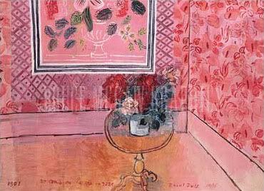
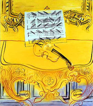
I've posted "Trente Ans Ou La Vie En Rose" by Dufy in conjunction with Edith Piaf's song "La Vie En Rose" (picked up by Louis Armstrong) here. I've always liked Dufy, and have carried around a postcard of his "Yellow Violin" for many years. Below are paintings by Dufy, where he captures diverse images from bouquets of flowers to the seaside, and some of his charming views through windows.

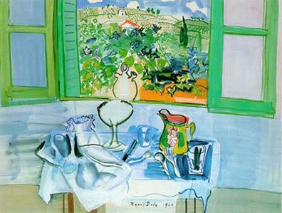
Nature Morte Devant La Fenetre, 1924

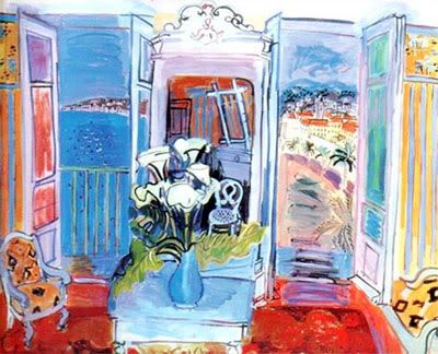
Interior With Open Window, 1928

Vue Sur Notre Dame, 1924

Bouquet d'Arums, 1939

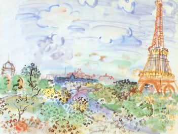
La Tour Eiffel, 1935

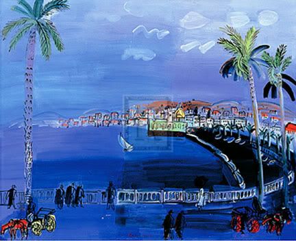
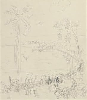
La Baie Des Anges, Nice, 1926

La Baie Des Anges, Nice
Looks like a sketch study
for the above painting.
Christie's describes it
as a print "stamped with
the artist's atelier stamp
(lower left)" and drawn with
"ink and pencil on paper"


Trente Ans Ou La Vie En Rose, 1931

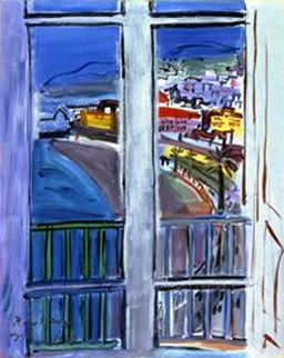
Window On The Promenade Des Anglais, Nice, 1938

The Philadelphia Museum of Art describes Dufy's "Window on the Promenade des Anglais, Nice" [above] from its Modern and Contemporary Art collection:
In this work Dufy depicts the view from the closed window of his studio in the Hôtel Suisse, which looked out over the Promenade des Anglais, the celebrated shoreline road fringed with palm trees that hugs the curved Bay of Angels in downtown Nice. The work owes an equal debt to Henri Matisse's earlier hotel window paintings and to Piet Mondrian's severely geometric abstractions. The rectilinear windowpanes, placed parallel to the picture plane, serve as a framing device for the hillside city, which Dufy has rendered in saturated colors dominated by the vibrant blue sea and sky.
----------------------------------------------------------------------------------------------------

Much of modern art is a rearrangement of reality, according to the visions and sentiments of the artists. The impressionists perhaps are at the cusp of bringing together what the artist saw and what the artist felt. Their art was still linked somewhat to reality, although the shimmering colors of Monet, and the psychedelic, moving lines of Van Gogh might have crossed the line to the other (their imaginary) side. Still, I think they were talented. Many went through rigorous training at various art institutions, and deconstructed, or reinvented, art through knowledge (and progress), rather than some malicious intent at destruction which is how our era is treating art.

Dufy works the thin like between impressionistic painting and line drawing. He cannot help splashing those glorious colors on the canvas, but he want to define them, and contain them, with his lines. No mad/unrestrained chroma explosion for him.

He of course deconstructs space too, but not as masterfully as Matisse, surely his mentor. His indoor spaces often seek the infinite freedom of the exterior by giving us a glimpse of this world through half open windows.

Perhaps the final quest of these artists is to attain some kind of glorious freedom, some utopic or paradisiacal world, right here on earth, and through their own creations. The restraints of civilization, of time and history, of culture, and even of etiquette were mildly scorned by them (and they seem mild compared to the advanced modernists.) But, they were still the draughtsmen of the demons which they unleashed into our world.

Still, beauty is beauty, and I think Dufy loved beauty.

Read More...

Saturday, December 24, 2011

Sacredness of Art?


Many times, it is during these holy days that we contemplate the images that depict our sacred Biblical characters.

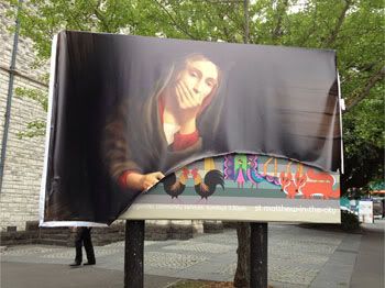
There is a discussion going on at Larry Auster's View From the Right about the recent image of Mary holding a pregnancy test which was cut to shreds by Catholic traditionalists in New Zealand.

A VFR reader writes, "I'm surprised by the fact that you cherished what can only be considered an act of barbarism."

Auster succinctly replies: "...you are sure that people who properly take action against intolerable things are morally backward."

That is just it. Non-Christians love to quote, or allude to, the "turn the other cheek" line in the the New Testament:
But I tell you, Do not resist an evil person. If someone strikes you on the right cheek, turn to him the other also. [Matthew 5:39]
I think they do this so that they can get away with their ultimate purpose, which is to destroy Christianity, and to have no retaliation in the process, having turned these "devout" Christians into inert bystanders.

When someone (or some people, or a whole society) starts the systematic destruction of our religion, standing by passively (and "piously") is actually sinful. We are allowing the message and word of God to go to ruin, destroyed by forces that hate it.

The other part of this story is of course that cultural items like paintings are more sacred than or equal to God. Therefore destroying them becomes worse than upholding God's name.

The poster itself is more than a poster. The artist has clearly spent time trying to make a pretty good painting of the Virgin Mary, using classic drawing and painting techniques. He isn't merely using a "poster" as a propaganda tool, but a work of art that mocks all other religious art which depict Mary in a true, holy manner. This ugly (not aesthetically, but morally) painting of Mary fools people into thinking it is the erudite, well-thought out, submission of an artist, when in fact it is mocking everything Mary, and God, stand for.

Therefore, the right reaction for this ugly work is to cut it to shreds with scissors, just as the Christians in New Zealand instinctively and confidently did.

The "reason" given for putting up this poster by the Anglican church St. Matthew-in-the-City is the usual "Christianity as a vehicle for social change" where:
Mary was unmarried, young, and poor. This pregnancy would shape her future. She was certainly not the first woman in this situation or the last.

As in the past it is our intention to avoid the sentimental, trite and expected to spark thought and conversation in the community. This year we hope to do so with an image and no words. We invite you to wonder what your caption might be.

Although the make-believe of Christmas is enjoyable - with tinsel, Santa, reindeer, and carols - there are also some realities. Many in our society are suffering: some through the lack of money, some through poor health, some through violence, and some through other hardships. The joy of Christmas is muted by anxiety.

In this season we encourage one another to be generous to those who suffer, to give to strangers, and to care for all – especially those who have the least. Like the first Santa, St Nicholas did. [From the St. Matthew-in-the-City website]

Read More...

Monday, December 19, 2011

More on Presidential Family Portraits

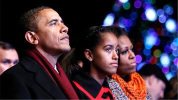
Malia Obama in 2011

In my previous post, Presidential family portraits, I tried to make a comprehensive analysis of the presidential portraits through the centuries. I should add that my critiques of the paintings and photographers are mostly cultural rather than aesthetic. Even the family sprawl of the Kennedys is endearing. Except when it comes to the Obamas, whose family portraits I really find odd and off-putting, with all the clutching that is going on.

But to describe a little more the aesthetic decisions in the portraits:

The perching on the arms of chairs (in the Truman family portrait and the Nixon family portrait) I think are aesthetic choices by the artists. In the Truman portrait, a type of pleasing triangular structure is formed, with Margaret appearing higher (standing would make her too high) to form the triangle. This is a common portrait strategy, which I describe here. This triangular form is somewhat used in the the Roosevelt photograph.

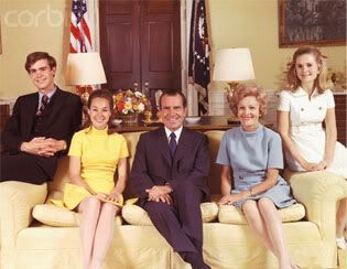
Framing the image is another common strategy, which is evident in the Nixon family portraits. In the top one, the older daughter and the mother frame the photograph. In the later portrait, David Eisenhower sits beside his wife Julie Nixon, perched on the sofa arm, (yes, the photo does attempt casualness), while Patricia Nixon completes the frame on the other side of the  sofa. There is also an attempt at symmetry, with President Nixon flanked by his (colorfully dressed) wife and daughter.

But, I wasn't trying to revisit these portraits. As I was looking through the many images out there of the Obama children, I was struck by the masculine, flat expression on Malia's face in recent photos (2011 especially). She used to look pretty as a little girl. It seems that some of her mother's empty harshness, and her father's arrogant air has rubbed on to her.

Read More...

Saturday, December 17, 2011

Presidential Family Portraits

Early presidential family portraits tend to be less formal than the presidents' portraits. Families are often sitting, gathered around a table, engaged in small activities which often consist of reading to one another.

Despite this casual air, almost all presidential family portraits nonetheless display some air of formality. Parents sit upright. Small children may be on laps, but seated, not sprawling. Standing members don't lounge, but lean gracefully on the backs of chairs or on a shoulder.

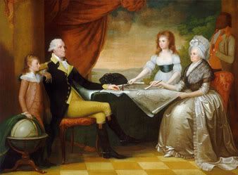
The Washington Family
By Edward Savage
Oil on Canvas
1789-1796
Andrew W. Mellon Collection
National Gallery of Art

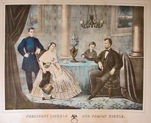
President Lincoln And Family Circle.
Respectfully Dedicated To The People Of The United States
Lithograph by A. Hohenstein.
Published by John Smith, 1865.
18 5/8 x 24 3/4.
[An interesting anecdote is that this lithograph was after a painting of Lincoln and his family by Francis Bicknell Carpenter, where he is reading to his son Tad. In Hohenstein's lithograph, Tad reads to his father.]

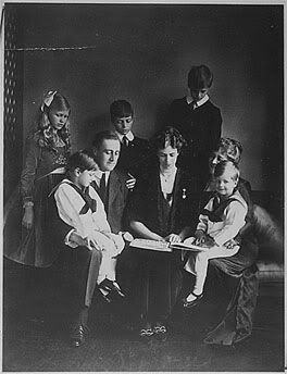
Franklin D. Roosevelt, Eleanor Roosevelt, and family
In Washington D.C.
June 12, 1919
(Picture courtesy the Franklin D. Roosevelt Library)

The Truman Family
By Greta Kempton
1952

The cut-off point for formal turning to casual seems to be the late 1950s. The reasons for this are complex, although they are mostly to do with the decline in authority and hierarchy in modern life, which brought forth the tumultuous 1960s. The Truman family portrait of 1952 subtly shows this change, where despite the parents' still formalized presentation, the young member of the family, the daughter, is sitting casually perched on the arm of her mother's chair.

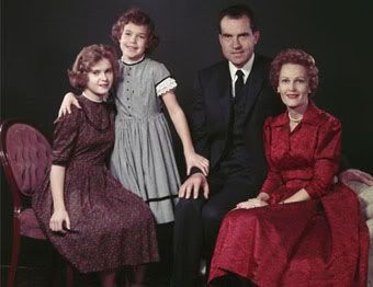
The 1959 family portrait of Vice President Nixon has his younger daughter Julie leaning on her sister Tricia, with her arm draped around Tricia's shoulder. And rather than placing her hand on her father's arm, she seems to be clutching on to it. This is very different from the gentle hand President Roosevelt's son places on his father's shoulder, or even the soft placement of Margaret's hand on the back of the chair. Still, while Julie is less restrained, all the rest are sitting upright. Perhaps such informality can be allowed for a young child. A later portrait, with the daughters as grown young women, shows the family in a more formal air (despite those 1960s mini-skirts).

Vice President Richard Nixon and his family, 1959

President Richard Nixon and his family, 1969

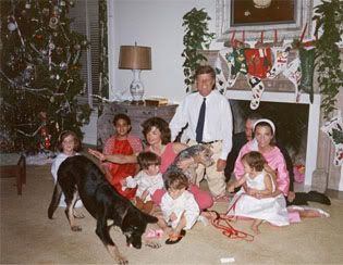
The sprawling, informal family portraits began with the Kennedys' 1962 Christmas photo, where the extended family, which included Jacqueline Kennedy's sister and her family, were part of the unofficial portrait that was available for the public. Previously, portraits were of the nuclear family: parents and children (without their spouses). And family members were carefully positioned to compose a structured tableau. Was it the catholic nature of the Kennedy family that allowed this departure from tradition?

The Reagan, and especially the Bush, families follow this example of extended family inclusion, albeit with somewhat more formal photographs.

President John F. Kennedy and First Lady Jacqueline Kennedy
on Christmas Day at the White House Dec. 25, 1962.
Caroline Kennedy, John F. Kennedy Jr. , Anthony Radziwill ,
Prince Stanislaus Radziwill, Lee Radziwill, Ann Christine Radziwill.
(John F. Kennedy Library/ Getty Images)

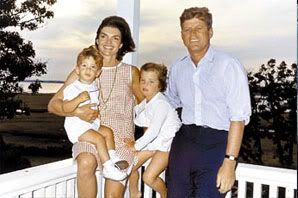
A later Kennedy "family portrait" is even more casual, where instead of the formal interior setting of the White House, the Kennedys posed at the porch of their Cape Cod vacation home, where Jackie is in a summer dress, and President Kennedy is in jeans and a shirt with the sleeves rolled up.

The Kennedy family at their Cape Cod vacation home,
Hyannis Port, August 4, 1962

This is perhaps one of the first photographs of children clutching at their mother which we will see in an exaggerated and inelegant form in the Obama photographs. But, Caroline seems to be holding on to her mother to avoid tumbling off her somewhat unstable perch.

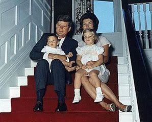
The Kennedys also posed in an informal manner sitting on stairs for a Christmas card family portrait, to have been released in December 1963, but which was cancelled after President Kennedy's assassination. Little John Kennedy is bare foot, and is held tightly (and somewhat clumsy) by his president father. The photo is endearing, but still I wonder at the (uncomfortable) casualness of it all.

A never-released Kennedy family portrait from 1963,
photographed just before President Kennedy's assassination

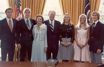
Portraits where all the protagonists are standing were rare in the past. I think that such portraits are imposing, especially if there is a large number of people. They are not necessarily formal. I'm not sure why this "tradition" started, and it seemed to have been initiated by the Fords, and later on followed by the Reagans.

A family portrait of Gerald Ford's family in the White House in 1974
Left to right:
Son Steven Ford, son John Ford,
First Lady Betty Ford, President Gerald Ford,
daughter Susan Ford,
and daughter-in-law Gayle Ann Ford
and her husband, Michael Ford.

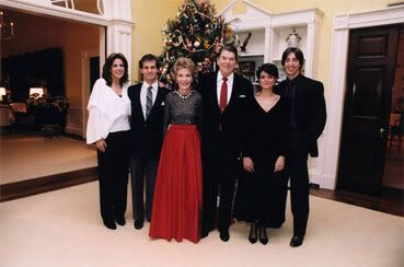
The Reagan family also opted to stand for their Christmas photo in 1983. Despite the "extended" family of children's spouses, with only two children and no grandchildren, this portrait is less of a sprawl compared to the Kennedy portrait.

Reagan family Christmas portrait, December 25, 1983

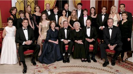
A sprawling Bush family portrait, which still has a formal air, includes:
President George W. Bush, first lady Laura Bush, former first lady Barbara Bush and former President George H.W. Bush sit surrounded by family in the Red Room of the White House January 6, 2005 in Washington, DC. Friends and family joined former President Bush and Barbara Bush in celebrating their 60th wedding
A 2005 Bush "extended" family portrait

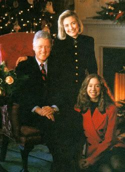
The Clintons avoid chaos in numbers in their family portraits because there is only three of them. Yet, Chelsea is too old to be sitting at her parents' feet (and wearing such a short skirt), and Hillary opts to perch on the chair's arm. These casual interjections distract from their well-groomed appearance. It's as though they want to contain casual and formal in one photograph.

Clinton Family Portrait, 1993

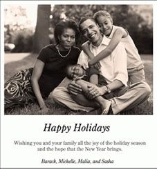
And finally to the clutching Obamas:

Obama Family Christmas card, 2006

The caption reads:
Happy Holidays [not Merry Christmas]
Wishing you and your family all the joy of the holiday season [no mention of Christmas, again. "Holiday season" uncapitalized...] and the hope that the New Year brings ["New Year" capitalized].
Barack, Michelle, Malia and Sasha [we are on first-name basis with the president].
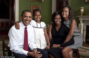
Obama family portrait, 2009

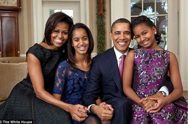
Just released Obama family portrait, 2011

The Obamas have released their family portrait, two years after their last one. I blogged about their 2009 portrait here, where I ask:
Why does Michelle allow her daughter to wrap herself around her like that?
I found the "wrapping around" odd behavior, despite the relaxed, family-oriented rather than formal, intent of the photograph. But, the collection of other presidential family portraits I've posted above, and even in the most casual shots, have a certain formality and decorum.

I continue:
What kind of daughter anyway (except for these self-conscious "low-self-esteem" types, who are always looking for attention) behaves like that?
I try to answer the question thus:
I think Michelle must be a distant, and not very affectionate mother, for all the talk she does about her daughters. And I think that Malia has to seek that affection.
In any case, irrespective of any psychological dynamics that go on within their house, many people avoid bringing them to the outside. Such an onus is especially placed on the First Family. Granted, modern-day presidential privileges are few, or tainted, such as having images of the couple and its family get taken at the oddest moments. But, such an adroit person as Michelle Obama surely could handle these difficulties. As I showed above, families with deep internal difficulties, including even the Clintons, often put on a brave and solid face before the public. The Obamas seem to just "let it all hang out."

Read More...