All for a chair
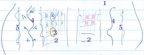
Below is a very rough sketch I did on my lined paper in blue ink as I was going through the Period Rooms (there is a very good summary at the link provided, including photographs) in the newly completed American Wing of the Metropolitan Museum of Art. The sketch is of the seat of an upholstered chair of the "neoclassical" period, and unfortunately I cannot find an image of it in the Met's vast online database.
I drew it because it characterized many things for me.
* Design, and fabric design, has always been about aesthetics, at times mere prettiness, at other times overwhelming luxury and sometimes just pure beauty.
* I felt going throughout the Period Rooms, which showcased about twenty rooms dating from the late seventeenth century to the early twentieth century, that people then had the confidence to design strong, beautiful pieces. Unlike our own period, whose gloomy designs I think begin around the 1970s - but more on that later.
* Craftsmanship was very important, but for the sake of constructing a harmonious, coherent piece.
* Color, intricate designs, patterns and other ornamentations were always present. There was hardly ever a "plain" chair, and if it existed, it was embellished by careful caning and weaving or luxurious materials like velvet.
* Looking at these rooms, there was nothing repellent about them, nothing "edgy." They were meant to be lived in, to be admired, and to be sources of pride for their owners.
 |
This small chair, hidden in a side room besides the "neoclassical" section, got my attention right away. This was a chair that was certainly not kept as a piece of art, but merely as a household furniture to keep a person comfortably seated, a person who probably only briefly glanced at it before sitting down. Yet so much attention was paid its design.
There are several design elements going on at once in the upholstery:
1. The background color of the upholstery is a creamy, ivory white.
2. There is a checkered pattern near the middle – where alternate squares are colored in pale pink so the overall middle section is dominated by this pale pink.
3. The outlines of gold flowers were embroidered on top of these checkers.
4. Realistic vines and leaves, were embroidered in the spaces to the right and left of the checkers, in variations of greens and browns – adding shading and texture to the vines and leaves.
5. On either side of the vines, were curved lines, embroidered again in gold.
6. The stripes were all done in greyish/silver to offset against the ivory white of the background.
So there was a mixture of: stylized flowers and realistic vines with leaves; straight and curved lines; and checkered squares filled alternately with delicate color. Such rich design, done with the utmost delicacy to harmonize everything together on a seat!
Of course this all didn’t come out of nowhere. In the room adjacent to this exquisite chair – notwithstanding my inadequate sketch! – two of the big three 18th century furniture designers’ books were cited:
George Hepplewhite’s Cabinet-maker and upholsterer’s guide (1788)
Thomas Sheraton’s Cabinet-maker and upholsterer’s drawing book (1793)
The third big name was Thomas Chippendale.


