Adolf Wissel vs. Norman Rockwell
While doing research on color and the history of modern art, I came across this website which talks about Hitler's abhorrence for modern art, so much so that he would set up degenerate art exhibitions to ridicule these painters.
Instead, he wanted art that glorified his Aryan concept.
Now, this type of commissioned art had nothing to do with 'artistic' requirements, but rather with ways to decimate Nazi propaganda.
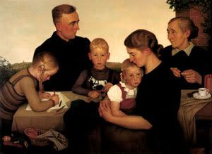
Here is a strange, claustrophobic, family portrait, which is certainly meant to promote the 'happy, Aryan family life.' It fails on many levels, although artistically, it is an exquisitely designed piece.
 |
The strangest thing about this portrait is the little boy, who is not quite in the center, and who looks directly at the viewer. Normally, one associates such a bold stare with a mature or heroic character. Not a disconcertingly young, and audacious boy.
But there are many more things going on in this picture:
1. There is no grandfather in the painting, which I'm sure is quite a deliberate omission. As though to say, we don't need our past, but must look into the future alone. It it the child-bearing women (the grandmother is present) who seem to matter more. In other words, create the world anew, by destroying it first - quite in league with the götterdämmerung for a new dawn.
 |
 |
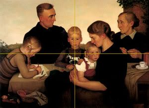
The bottom picture is the original.
(Click on images to view larger sizes without lines)
2. The boy is not really in the center of the original painting. If he were 'designed' thus, he would be visually separate him from everyone else. He would not fit in with his protective father, nor with the nurturing mother, but remain as a direct and lonely focal point
Ironically, the picture with the centered boy is also the more claustrophobic, and it is the less successful design of the two. The artist was correct to compose his painting in the original manner.
Yet, this original composition, as well as being true to design, is really true to sentiment and psychology as well.
As the visually centered character, the boy would then really be on his own. I would suspect that the painter is projecting his own immaturity and lack of independence by avoiding this central position for the boy. But the painter still doesn't underestimate the aggressive and audacious character of the boy, making him stare at us with a bold and insolent stare.
This goes quite well with the National Socialists, who never wanted the father figure too far away, being unable to mature into independent and responsible men. But, they were aggressive, demanding and ruthless little boys at heart.
3. The women seem to have an even stronger presence here. The father's connection is with the old woman, presumably his mother. Not with his father, who is absent. And the rather burly young girl on the left is busy with her books, suggesting the rather masculine role many Nazi women were to play later on. Of course the wife is the child bearer, producing both the young boy (future leader) and the young girls (a future feminist and a future mother).
4. There is no centered visual hierarchy of people here. Although the father dominates a mini-pyramid of his daughter (to the left) and his son, he is in the background. His wife seems to have some more prominence, being in the foreground. And the father's timid eye-contact with the grandmother seems to make her his center. As mentioned, the young boy seems to dominate the scene.
5. The colors are warm browns and yellows, and there appears to be a lively dusk sky behind. But any warmth has be negated by the claustrophobic arrangements of the people in their dark clothes and dour expressions. It really is to close the end of the day/world.
6. For a farm family, there is very little farm food around. Whatever is displayed is consigned to the small left-hand corner of the picture.
7. The horizon seems to have been flattened out as though we’re in some stage-set interior with a backdrop, full of fantasy and manipulation.
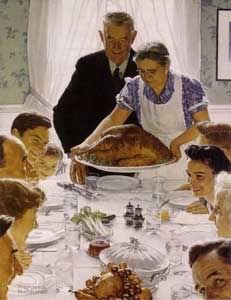
Now contrast this with the Rockwell painting.
 |
1. The grandfather is the center, both pictorially and actually - there is no ambiguity about that.
2. The picture is designed in the classic pyramidal fashion, with the important figures at the top of the pyramid (grandfather and grandmother) and the rest of family widening out to the base.
3. Unlike the Wissel whose nature which we cannot seem to reach, Rockwell has brought nature into to the family, with the turkey, fruits and vegetables all laid out on the table. Rockwell's Nature is really abundant.
4. All the food follows the central and important axis, with the grandfather at the top. A true thanksgiving for the abundant fruits of the land.
5. Although we are indoors, there is a sense of space and light. The elongated perspective of the white table connects with the bright window at the back which promises to take us out into the sunny mid-day exterior.
6. Finally, this family seems to be fully enjoying the moment. And even the one person looking at us is doing so with a sense of fun and mischief.


